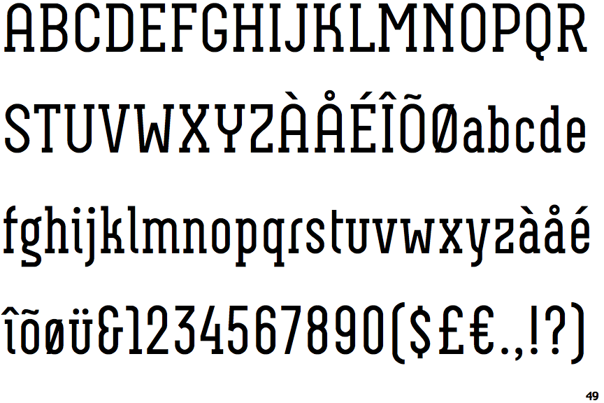
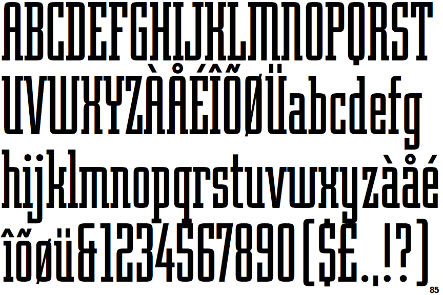
Differences
Neubau Serif
 |
The '&' (ampersand) looks like 'Et' with a gap at the top.
|
 |
The centre vertex of the upper-case 'M' is above the baseline.
|
 |
The top storey of the '3' is a sharp angle.
|
 |
The lower-case 'g' is double-storey (with or without gap).
|
 |
The upper-case 'U' has no stem/serif.
|
 |
The feet of the lower-case 'h' have two serifs on each foot.
|
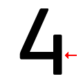 |
The bar of the '4' does not cross the vertical.
|
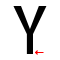 |
The upper-case 'Y' has no pedestal.
|
Note that the fonts in the icons shown above represent general examples, not necessarily the two fonts chosen for comparison.
Show ExamplesRobotik
 |
The '&' (ampersand) looks like 'Et' with one enclosed loop (with or without exit stroke).
|
 |
The centre vertex of the upper-case 'M' is on the baseline.
|
 |
The top storey of the '3' is a smooth curve.
|
 |
The lower-case 'g' is single-storey (with or without loop).
|
 |
The upper-case 'U' has a stem/serif.
|
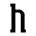 |
The feet of the lower-case 'h' have one serif on each foot, facing outwards.
|
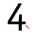 |
The bar of the '4' crosses the vertical.
|
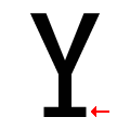 |
The upper-case 'Y' has a pedestal.
|
