Identifont

Fonts by Appearance

Fonts by Name

Fonts by Similarity

Fonts by Picture

Fonts by Designer/Publisher

Differences

TweetTweet Differences

Compare: and  

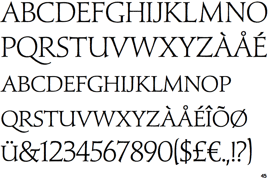
Nero Light

Nero Light

Closed
The '&' (ampersand) is traditional style with two enclosed loops.
On
The upper-case 'J' sits on the baseline.
Three
The top of the upper-case 'W' has three upper terminals.
None
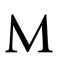
The top vertices of the upper-case 'M' have no top serifs.

Note that the fonts in the icons shown above represent general examples, not necessarily the two fonts chosen for comparison.

Show Examples
Light Classic Roman

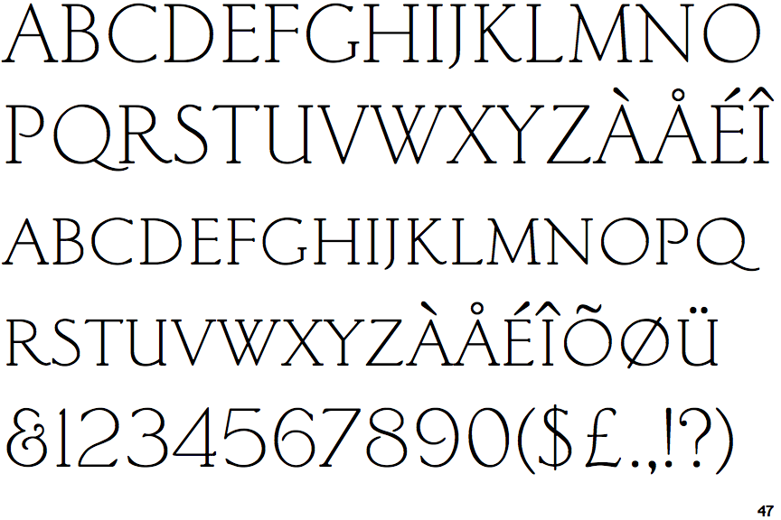
Light Classic Roman

Gap top
The '&' (ampersand) looks like 'Et' with a gap at the top.
Below
The upper-case 'J' descends below the baseline.
Four
The top of the upper-case 'W' has four upper terminals.
Single
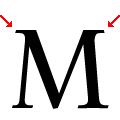
The top vertices of the upper-case 'M' have symmetrical single-sided serifs.