 |
The lower-case 'g' is single-storey (with or without loop).
|
 |
The lower-case 'a' stem stops at the top of the bowl (single storey).
|
 |
The upper-case 'A' has parallel verticals.
|
 |
The upper-case 'E' is drawn as a 'C' with a bar.
|
 |
The sides of the lower-case 'y' are parallel (U-shaped).
|
 |
The bar of the lower-case 'f' is single-sided.
|
 |
The lower-case 'u' has no stem/serif.
|
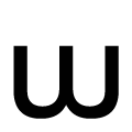 |
The centre strokes of the lower-case 'w' form one centre stroke.
|
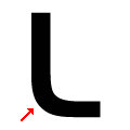 |
The foot of the upper-case 'L' is rounded.
|
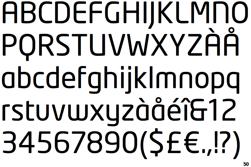
Note that the fonts in the icons shown above represent general examples, not necessarily the two fonts chosen for comparison.
Show Examples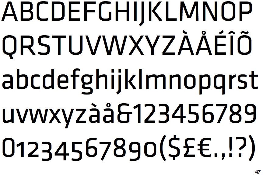
 |
The lower-case 'g' is double-storey (with or without gap).
|
 |
The lower-case 'a' stem curves over the top of the bowl (double storey).
|
 |
The upper-case 'A' has tapered verticals.
|
 |
The upper-case 'E' is normal letter shape.
|
 |
The sides of the lower-case 'y' are angled (V-shaped).
|
 |
The bar of the lower-case 'f' is double-sided.
|
 |
The lower-case 'u' has a stem/serif.
|
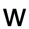 |
The centre strokes of the lower-case 'w' meet at a vertex.
|
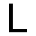 |
The foot of the upper-case 'L' is sharp.
|