 |
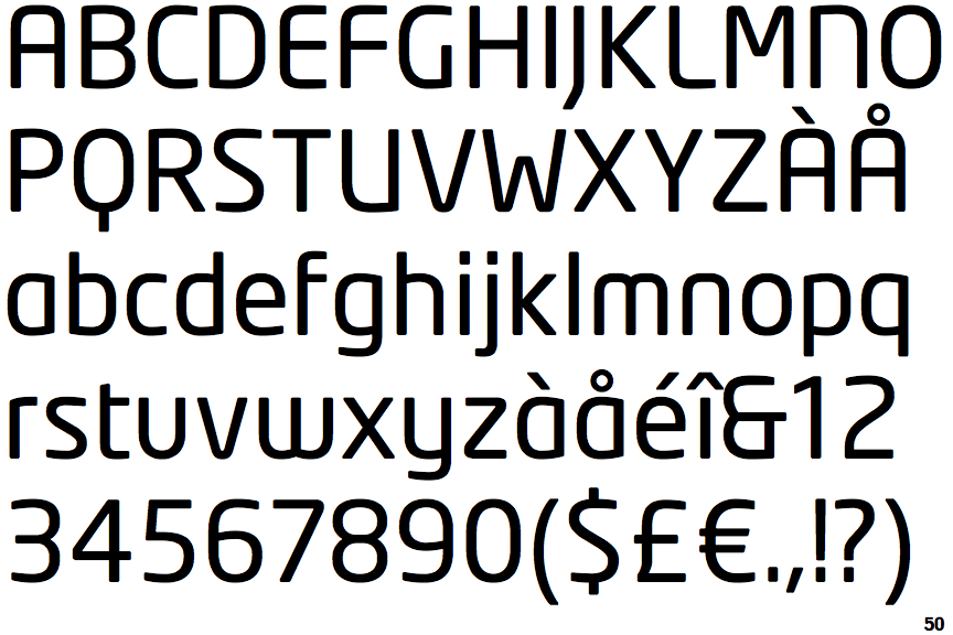
The '$' (dollar) has a single line which does not cross the 'S'.
|
 |
The '&' (ampersand) looks like 'Et' with one enclosed loop (with or without exit stroke).
|
 |
The upper-case 'J' descends below the baseline.
|
 |
The centre vertex of the upper-case 'M' is above the baseline.
|
 |
The lower-case 'a' stem stops at the top of the bowl (single storey).
|
 |
The upper-case 'G' has no bar.
|
 |
The leg of the upper-case 'R' is straight.
|
 |
The upper-case 'A' has parallel verticals.
|
 |
The lower-case 'e' has a straight horizontal bar.
|
 |
The bar of the lower-case 'f' is single-sided.
|
There are more than ten differences; only the first ten are shown.
Note that the fonts in the icons shown above represent general examples, not necessarily the two fonts chosen for comparison.
Show Examples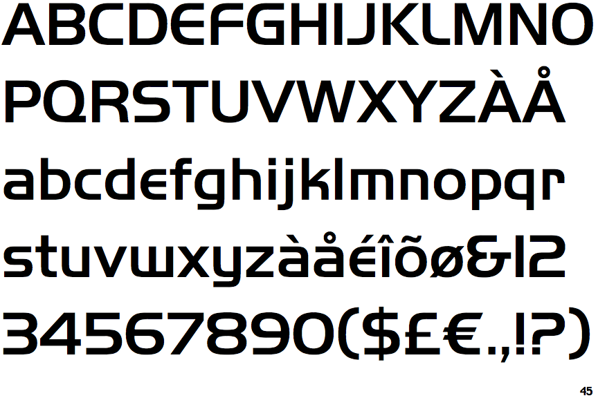
 |
The '$' (dollar) has a single line crossing the 'S'.
|
 |
The '&' (ampersand) looks like 'Et' with a gap at the top.
|
 |
The upper-case 'J' sits on the baseline.
|
 |
The centre vertex of the upper-case 'M' is on the baseline.
|
 |
The lower-case 'a' stem curves over the top of the bowl (double storey).
|
 |
The upper-case 'G' has a bar to the left.
|
 |
The leg of the upper-case 'R' is curved outwards.
|
 |
The upper-case 'A' has tapered verticals.
|
 |
The lower-case 'e' is drawn as a 'c' with a bar.
|
 |
The bar of the lower-case 'f' is double-sided.
|