Identifont

Fonts by Appearance

Fonts by Name

Fonts by Similarity

Fonts by Picture

Fonts by Designer/Publisher

Differences

TweetTweet Differences

Compare: and  

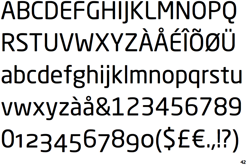
Neo Sans

Neo Sans

Closed
The '&' (ampersand) is traditional style with two enclosed loops.
Left
The tail of the lower-case 'y' is curved or U-shaped to the left.
No gap
The lower storey of the lower-case 'g' has no gap.
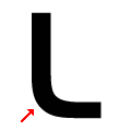
Rounded
The foot of the upper-case 'L' is rounded.

Note that the fonts in the icons shown above represent general examples, not necessarily the two fonts chosen for comparison.

Show Examples
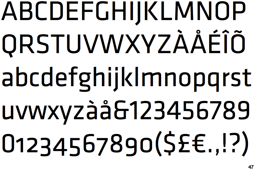
Klavika

Klavika

Et shaped
The '&' (ampersand) looks like 'Et' with one enclosed loop (with or without exit stroke).
Straight
The tail of the lower-case 'y' is substantially straight.
Gap
The lower storey of the lower-case 'g' has a gap.
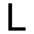
Sharp
The foot of the upper-case 'L' is sharp.