 |
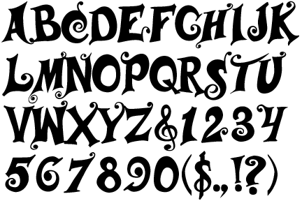
The verticals of the upper-case 'M' are sloping.
|
 |
The top storey of the '3' is a smooth curve.
|
 |
The upper-case 'U' has no stem/serif.
|
 |
The top of the upper-case 'A' has serifs both sides, or a top bar.
|
 |
The upper-case 'G' foot has no spur or serif.
|
 |
The upper-case 'E' is normal letter shape.
|
Note that the fonts in the icons shown above represent general examples, not necessarily the two fonts chosen for comparison.
Show Examples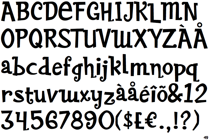
 |
The verticals of the upper-case 'M' are parallel.
|
 |
The top storey of the '3' is a sharp angle.
|
 |
The upper-case 'U' has a stem/serif.
|
 |
The top of the upper-case 'A' has a serif or cusp on the left.
|
 |
The upper-case 'G' foot has a downward pointing spur.
|
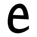 |
The upper-case 'E' is like a lower-case 'e'.
|