Differences
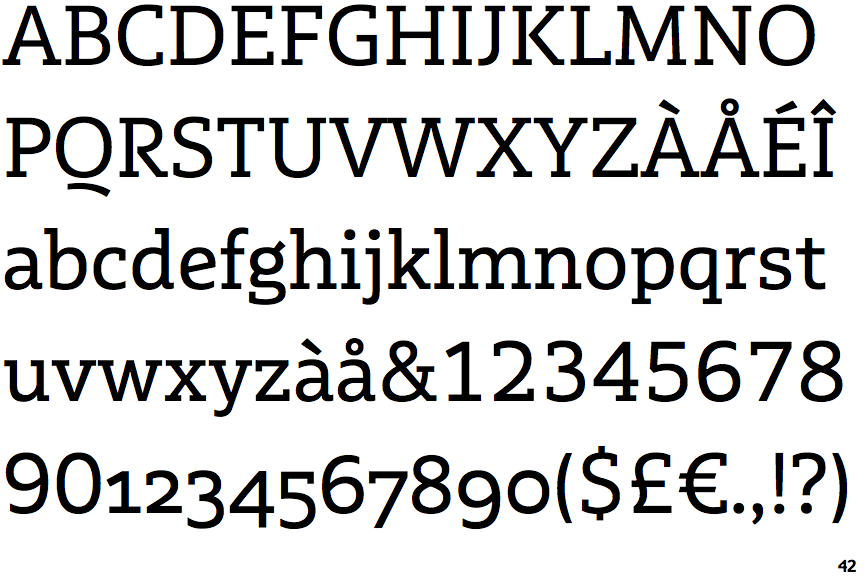
Multiple Slab Alternate II
 |
The upper-case 'Q' tail is below and separated from the circle.
|
 |
The diagonal strokes of the upper-case 'K' meet at the vertical (with or without a gap).
|
 |
The centre bar of the upper-case 'R' leaves a gap with the vertical.
|
 |
The centre vertex of the upper-case 'W' has two separate serifs.
|
 |
The lower-case 'e' has a straight angled bar.
|
 |
The lower storey of the lower-case 'g' has a gap.
|
Note that the fonts in the icons shown above represent general examples, not necessarily the two fonts chosen for comparison.
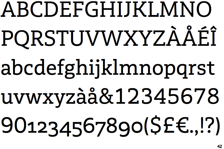
Show ExamplesMultiple Slab
 |
The upper-case 'Q' tail touches the circle.
|
 |
The diagonal strokes of the upper-case 'K' connect to the vertical via a horizontal bar.
|
 |
The centre bar of the upper-case 'R' meets the vertical.
|
 |
The centre vertex of the upper-case 'W' has no serifs.
|
 |
The lower-case 'e' has a straight horizontal bar.
|
 |
The lower storey of the lower-case 'g' has no gap.
|

