 |
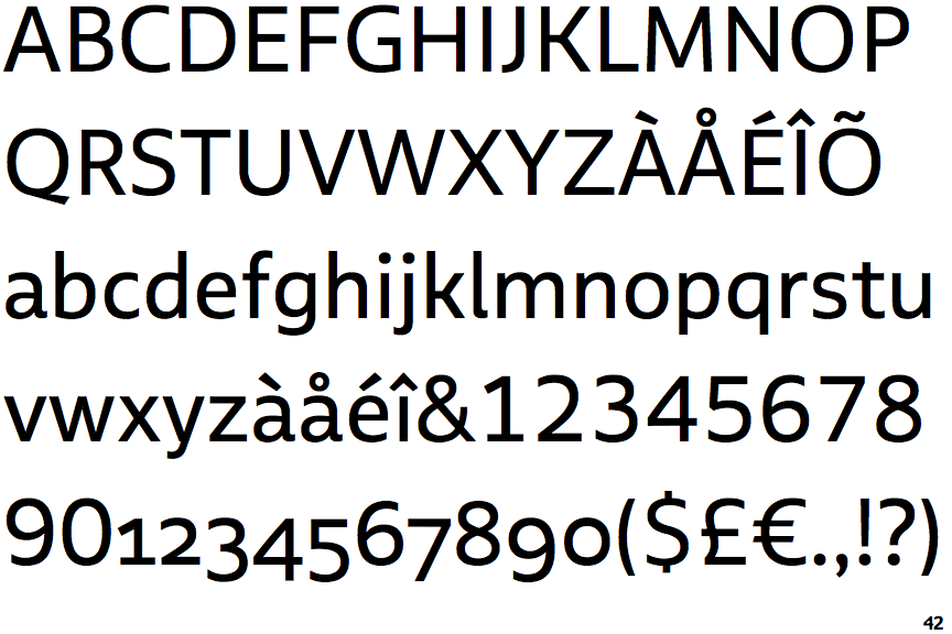
The upper-case 'Q' tail touches the circle.
|
 |
The lower-case 'g' is single-storey (with or without loop).
|
 |
The lower-case 'a' stem curves over the top of the bowl (double storey).
|
 |
The upper-case 'J' has no bar.
|
 |
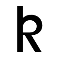
The leg of the upper-case 'R' is straight.
|
 |
The upper-case 'E' is normal letter shape.
|
 |
The sides of the lower-case 'y' are angled (V-shaped).
|
 |
The lower-case 'e' has a straight horizontal bar.
|
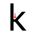 |
The diagonal strokes of the lower-case 'k' connect to the vertical via a horizontal bar.
|
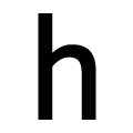 |
The lower-case 'h' has no exit stroke.
|
There are more than ten differences; only the first ten are shown.
Note that the fonts in the icons shown above represent general examples, not necessarily the two fonts chosen for comparison.
Show Examples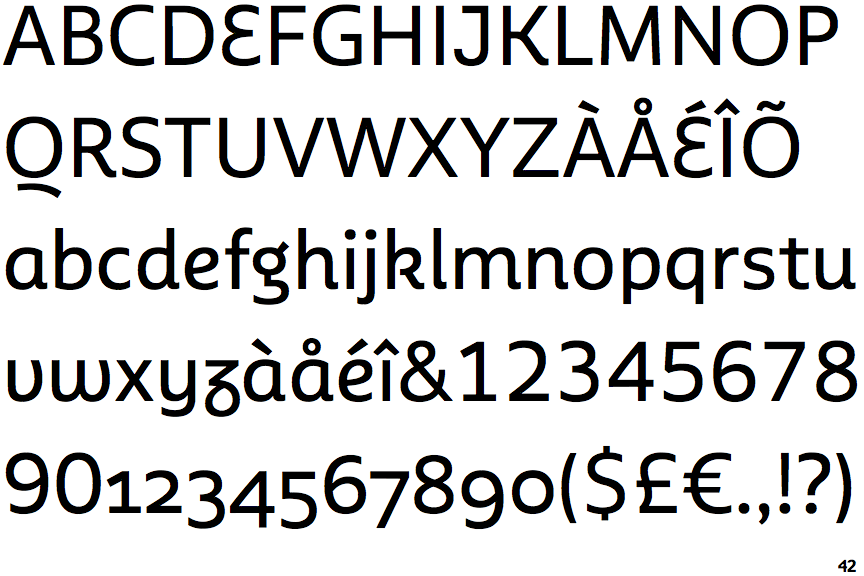
 |
The upper-case 'Q' tail is below and separated from the circle.
|
 |
The lower-case 'g' is double-storey (with or without gap).
|
 |
The lower-case 'a' stem stops at the top of the bowl (single storey).
|
 |
The upper-case 'J' has a bar to the left.
|
 |
The leg of the upper-case 'R' is curved inwards.
|
 |
The upper-case 'E' is drawn as a single stroke (with or without loop).
|
 |
The sides of the lower-case 'y' are parallel (U-shaped).
|
 |
The lower-case 'e' has a curved bar with no straight segment.
|
 |
The diagonal strokes of the lower-case 'k' form a loop.
|
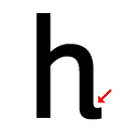 |
The lower-case 'h' has an exit stroke.
|