Differences
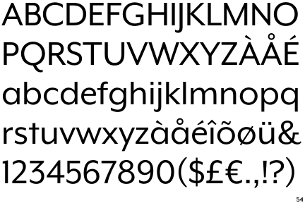
Mr Eaves XL Modern
 |
The upper-case 'Q' tail touches the circle.
|
 |
The upper-case 'J' descends below the baseline.
|
 |
The diagonal strokes of the upper-case 'K' meet at the vertical (with or without a gap).
|
 |
The centre vertex of the upper-case 'M' is on the baseline.
|
 |
The lower-case 'a' stem stops at the top of the bowl (single storey).
|
 |
The tail of the lower-case 'y' is substantially straight.
|
Note that the fonts in the icons shown above represent general examples, not necessarily the two fonts chosen for comparison.
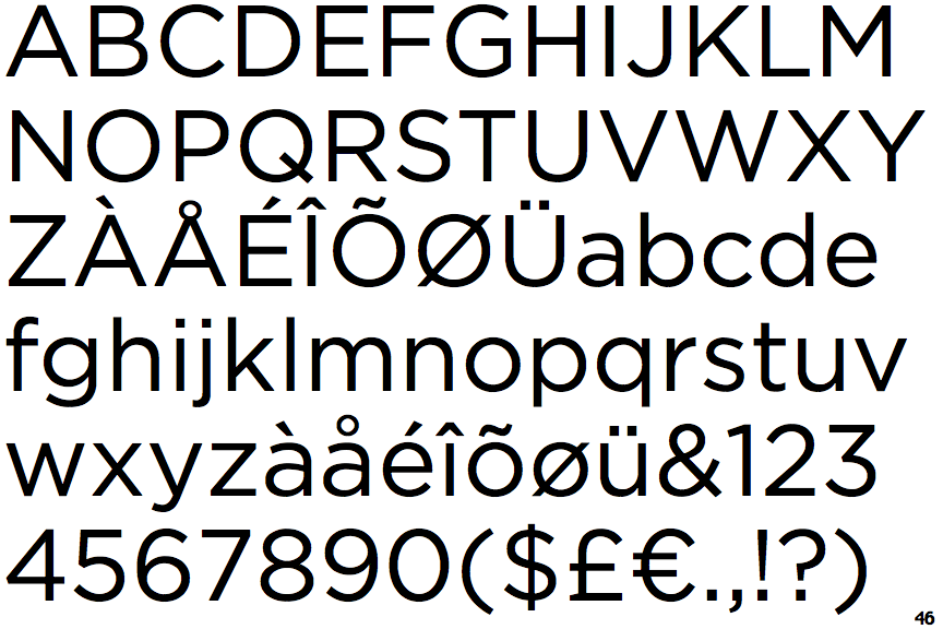
Show ExamplesGotham
 |
The upper-case 'Q' tail crosses the circle.
|
 |
The upper-case 'J' sits on the baseline.
|
 |
The diagonal strokes of the upper-case 'K' meet in a 'T'.
|
 |
The centre vertex of the upper-case 'M' is above the baseline.
|
 |
The lower-case 'a' stem curves over the top of the bowl (double storey).
|
 |
The tail of the lower-case 'y' is curved or U-shaped to the left.
|

