 |
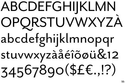
The top storey of the '3' is a sharp angle.
|
 |
The upper-case 'G' has a bar to the left.
|
 |
The leg of the upper-case 'R' is curved inwards.
|
 |
The top of the lower-case 'q' has a vertical or slightly angled spur (pointed or flat).
|
 |
The lower storey of the lower-case 'g' has a gap.
|
Note that the fonts in the icons shown above represent general examples, not necessarily the two fonts chosen for comparison.
Show Examples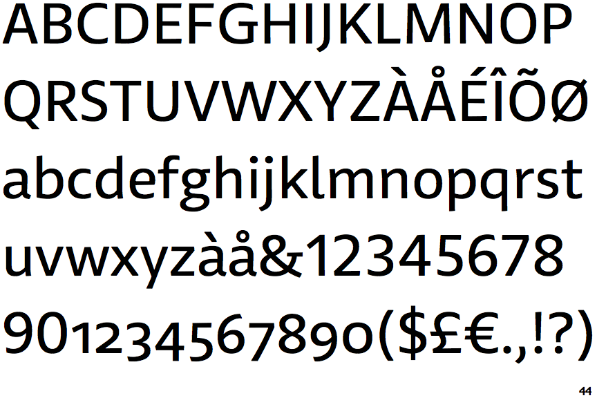
 |
The top storey of the '3' is a smooth curve.
|
 |
The upper-case 'G' has double-sided bar.
|
 |
The leg of the upper-case 'R' is straight.
|
 |
The top of the lower-case 'q' has no spur or serif.
|
 |
The lower storey of the lower-case 'g' has no gap.
|