Identifont

Fonts by Appearance

Fonts by Name

Fonts by Similarity

Fonts by Picture

Fonts by Designer/Publisher

Differences

TweetTweet Differences

Compare: and  

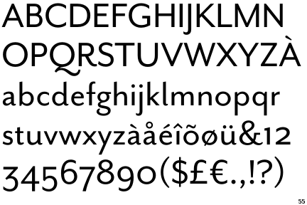
Mr Eaves Sans

Mr Eaves Sans

Angled
The top storey of the '3' is a sharp angle.
Right
The 'l' (lower-case 'L') has a right-facing lower serif or tail.
Straight
The tail of the lower-case 'y' is substantially straight.
Gap
The lower storey of the lower-case 'g' has a gap.

Note that the fonts in the icons shown above represent general examples, not necessarily the two fonts chosen for comparison.

Show Examples
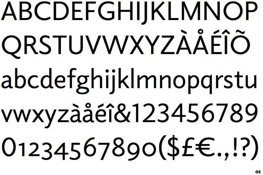
Elido

Elido

Round
The top storey of the '3' is a smooth curve.
Plain
The 'l' (lower-case 'L') has no serifs or tail.
Left
The tail of the lower-case 'y' is curved or U-shaped to the left.
No gap
The lower storey of the lower-case 'g' has no gap.