 |
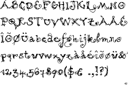
The '&' (ampersand) is traditional style with two enclosed loops.
|
 |
The centre vertex of the upper-case 'M' is on the baseline.
|
 |
The upper-case 'J' has a bar both sides.
|
 |
The leg of the upper-case 'R' is curved inwards.
|
 |
The upper-case 'E' is drawn as a single stroke (with or without loop).
|
 |
The '7' has a bar.
|
 |
The foot of the '£' (pound) has a loop.
|
Note that the fonts in the icons shown above represent general examples, not necessarily the two fonts chosen for comparison.
Show Examples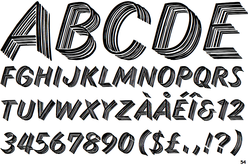
 |
The '&' (ampersand) looks like 'Et' with a gap at the top.
|
 |
The centre vertex of the upper-case 'M' is above the baseline.
|
 |
The upper-case 'J' has no bar.
|
 |
The leg of the upper-case 'R' is straight.
|
 |
The upper-case 'E' is normal letter shape.
|
 |
The '7' has no bar.
|
 |
The foot of the '£' (pound) has no loop.
|