 |
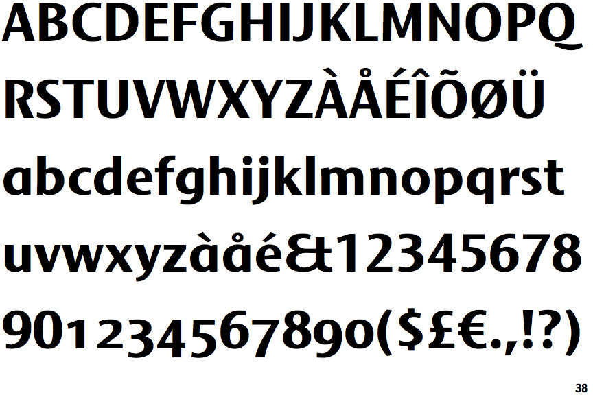
The upper-case 'Q' tail is below and separated from the circle.
|
 |
The '&' (ampersand) looks like 'Et' with one enclosed loop (with or without exit stroke).
|
 |
The upper-case 'J' sits on the baseline.
|
 |
The centre vertex of the upper-case 'M' is above the baseline.
|
 |
The upper-case 'G' has a bar to the left.
|
 |
The centre bar of the upper-case 'R' leaves a gap with the vertical.
|
 |
The centre strokes of the upper-case 'W' meet at a vertex.
|
Note that the fonts in the icons shown above represent general examples, not necessarily the two fonts chosen for comparison.
Show Examples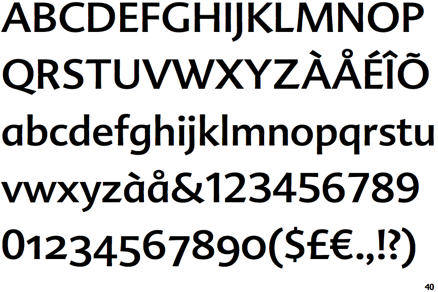
 |
The upper-case 'Q' tail touches the circle.
|
 |
The '&' (ampersand) is traditional style with a gap at the top.
|
 |
The upper-case 'J' descends below the baseline.
|
 |
The centre vertex of the upper-case 'M' is on the baseline.
|
 |
The upper-case 'G' has no bar.
|
 |
The centre bar of the upper-case 'R' meets the vertical.
|
 |
The centre strokes of the upper-case 'W' meet in a T on the left.
|