 |
The upper-case 'Q' tail touches the circle.
|
 |
The '4' is open.
|
 |
The dot on the '?' (question-mark) is circular or oval.
|
 |
The top storey of the '3' is a sharp angle.
|
 |
The upper-case 'G' has no spur/tail.
|
|
The upper-case 'G' has no bar.
|
 |
The upper-case 'J' has a bar to the left.
|
 |
The leg of the upper-case 'R' is straight.
|
 |
The dot on the lower-case 'i' or 'j' is circular or oval.
|
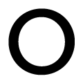 |
The lower-case letter 'o' is circular or equal proportions.
|
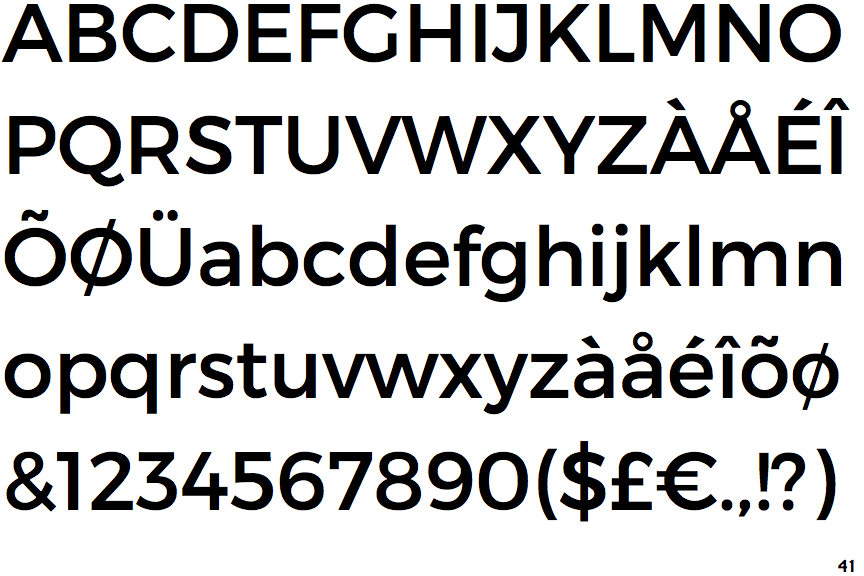
Note that the fonts in the icons shown above represent general examples, not necessarily the two fonts chosen for comparison.
Show Examples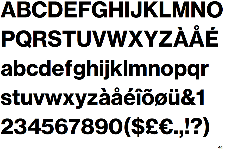
 |
The upper-case 'Q' tail crosses the circle.
|
 |
The '4' is closed.
|
 |
The dot on the '?' (question-mark) is square or rectangular.
|
 |
The top storey of the '3' is a smooth curve.
|
 |
The upper-case 'G' has a spur/tail.
|
 |
The upper-case 'G' has a bar to the left.
|
 |
The upper-case 'J' has no bar.
|
 |
The leg of the upper-case 'R' is curved outwards.
|
 |
The dot on the lower-case 'i' or 'j' is square or rectangular.
|
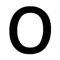 |
The lower-case letter 'o' is taller than it is wide.
|