Identifont

Fonts by Appearance

Fonts by Name

Fonts by Similarity

Fonts by Picture

Fonts by Designer/Publisher

Differences

TweetTweet Differences

Compare: and  

Montage

Montage

Open
The '4' is open.
Double
The diagonal strokes of the upper-case 'K' meet in a 'T'.
Spur
The upper-case 'G' has a spur/tail.
Right
The strokes are sloped right (italic, oblique, or cursive).
None
The bar of the upper-case 'G' is no bar.

Note that the fonts in the icons shown above represent general examples, not necessarily the two fonts chosen for comparison.

Show Examples
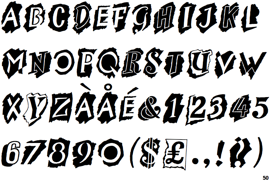
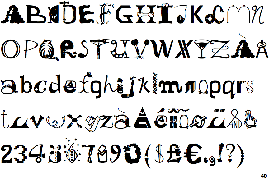
Old Dreadful No. 7

Old Dreadful No. 7

Closed
The '4' is closed.
Single
The diagonal strokes of the upper-case 'K' meet at the vertical (with or without a gap).
No spur
The upper-case 'G' has no spur/tail.
Upright
The strokes are upright.
Double
The bar of the upper-case 'G' is double-sided.