 |
The diagonal strokes of the upper-case 'K' meet at the vertical (with or without a gap).
|
 |
The verticals of the upper-case 'M' are parallel.
|
 |
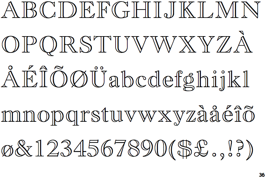
The characters are outlined, shaded, or filled with a pattern.
|
 |
The top of the upper-case 'A' has a serif or cusp on the left.
|
 |
The top stroke of the upper-case 'C' has a vertical or angled upward-pointing serif.
|
 |
The upper-case 'G' foot has no spur or serif.
|
 |
The centre vertex of the upper-case 'W' has two separate serifs.
|
 |
The top stroke of the upper-case 'S' has a vertical or angled upward-pointing serif.
|
Note that the fonts in the icons shown above represent general examples, not necessarily the two fonts chosen for comparison.
Show Examples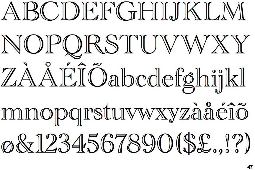
 |
The diagonal strokes of the upper-case 'K' meet in a 'T'.
|
 |
The verticals of the upper-case 'M' are sloping.
|
 |
The characters are solid.
|
 |
The top of the upper-case 'A' has no serifs or cusps.
|
 |
The top stroke of the upper-case 'C' has no upward-pointing serif.
|
 |
The upper-case 'G' foot has a forward pointing spur or serif.
|
 |
The centre vertex of the upper-case 'W' has no serifs.
|
 |
The top stroke of the upper-case 'S' has no upward-pointing serif.
|