 |
The lower-case 'i' or 'j' is lower than the k and l.
|
Note that the fonts in the icons shown above represent general examples, not necessarily the two fonts chosen for comparison.
Show Examples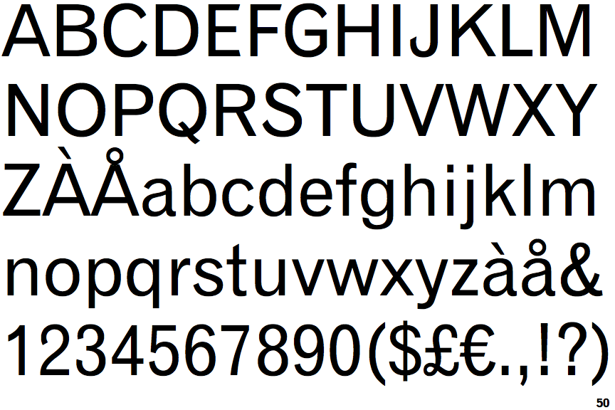
 |
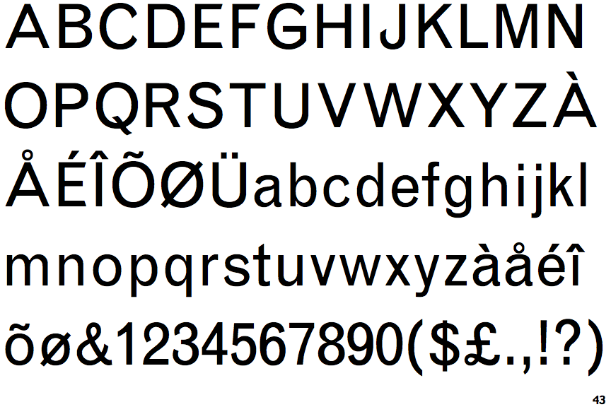
The lower-case 'i' or 'j' is the same height as the k and l.
|