 |
The '$' (dollar) has a single line crossing the 'S'.
|
 |
The upper-case 'J' descends below the baseline.
|
 |
The centre vertex of the upper-case 'M' is on the baseline.
|
 |
The lower-case 'g' is double-storey (with or without gap).
|
 |
The top of the upper-case 'A' has no serifs or cusps.
|
 |
The centre vertex of the upper-case 'W' has two separate serifs.
|
 |
The lower-case 'e' has a straight angled bar.
|
 |
The feet of the lower-case 'h' have two serifs on each foot.
|
 |
The feet of the lower-case 'm' have two serifs on each foot.
|
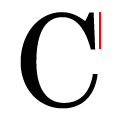 |
The top serif of the upper-case 'C' is vertical or nearly vertical.
|
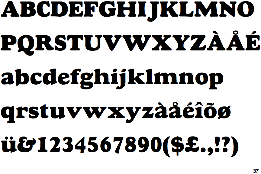
There are more than ten differences; only the first ten are shown.
Note that the fonts in the icons shown above represent general examples, not necessarily the two fonts chosen for comparison.
Show Examples
 |
The '$' (dollar) has a single line which does not cross the 'S'.
|
 |
The upper-case 'J' sits on the baseline.
|
 |
The centre vertex of the upper-case 'M' is above the baseline.
|
 |
The lower-case 'g' is single-storey (with or without loop).
|
 |
The top of the upper-case 'A' has a serif or cusp on the left.
|
 |
The centre vertex of the upper-case 'W' has no serifs.
|
 |
The lower-case 'e' has a straight horizontal bar.
|
 |
The feet of the lower-case 'h' have two serifs on the left and one on the right.
|
 |
The feet of the lower-case 'm' have two serifs on the left, and one on the centre and right.
|
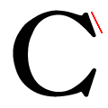 |
The top serif of the upper-case 'C' is angled left.
|