 |
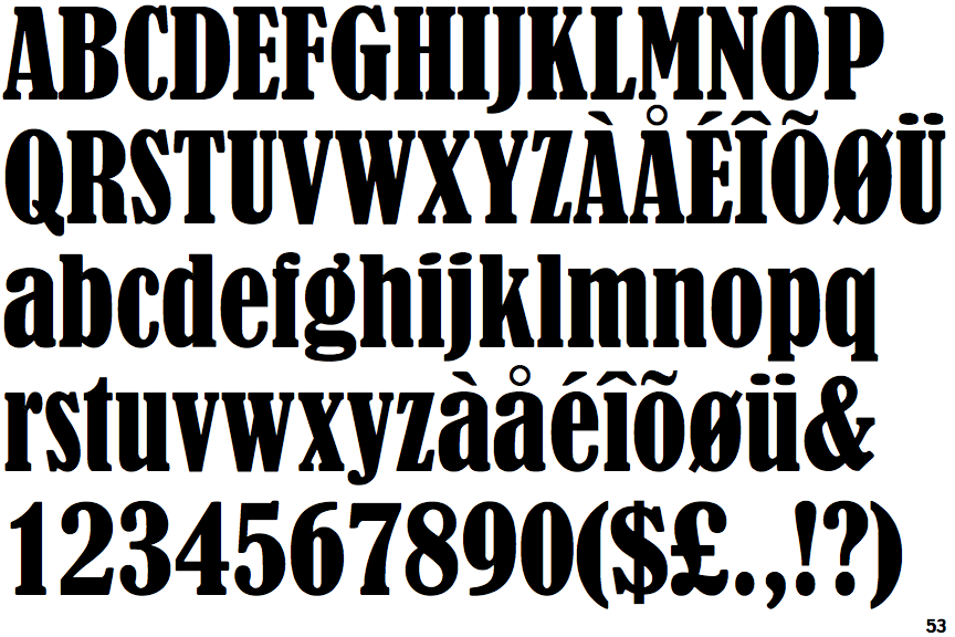
The upper-case 'Q' tail crosses the circle.
|
 |
The top stroke of the upper-case 'S' has a vertical or angled upward-pointing serif.
|
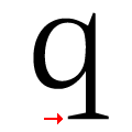 |
The tail of the lower-case 'q' has serifs on both sides.
|
Note that the fonts in the icons shown above represent general examples, not necessarily the two fonts chosen for comparison.
Show Examples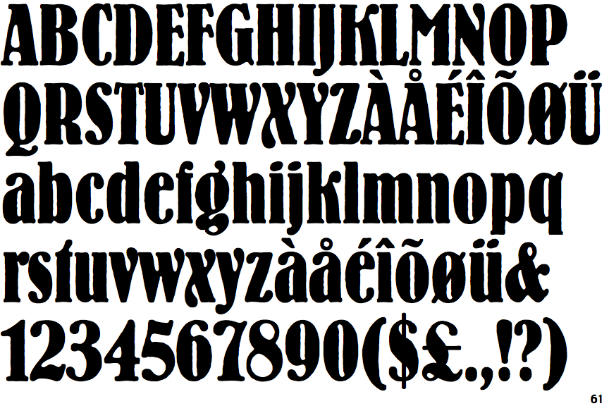
 |
The upper-case 'Q' tail touches the circle.
|
 |
The top stroke of the upper-case 'S' has no upward-pointing serif.
|
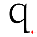 |
The tail of the lower-case 'q' has a single right-facing serif.
|