 |
The '&' (ampersand) is traditional style with two enclosed loops.
|
 |
The top storey of the '3' is a sharp angle.
|
 |
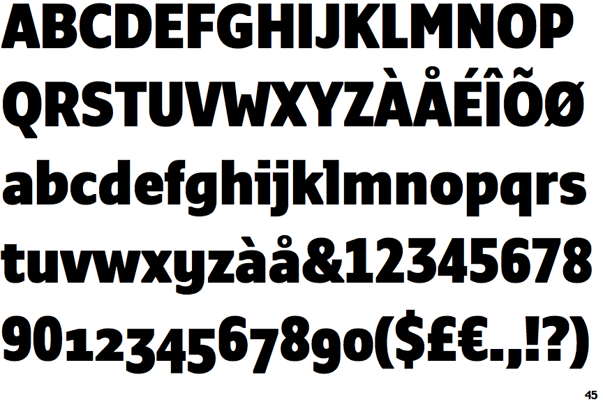
The 'l' (lower-case 'L') has a left-facing upper serif.
|
 |
The leg of the upper-case 'R' is straight.
|
 |
The top of the lower-case 'q' has no spur or serif.
|
 |
The sides of the lower-case 'y' are parallel (U-shaped).
|
 |
The lower-case 'i' has a left-facing upper serif.
|
 |
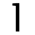
The tail of the lower-case 'j' is curved with an upper serif.
|
 |
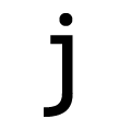
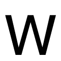
The centre vertex of the upper-case 'W' is below the outer strokes.
|
Note that the fonts in the icons shown above represent general examples, not necessarily the two fonts chosen for comparison.
Show Examples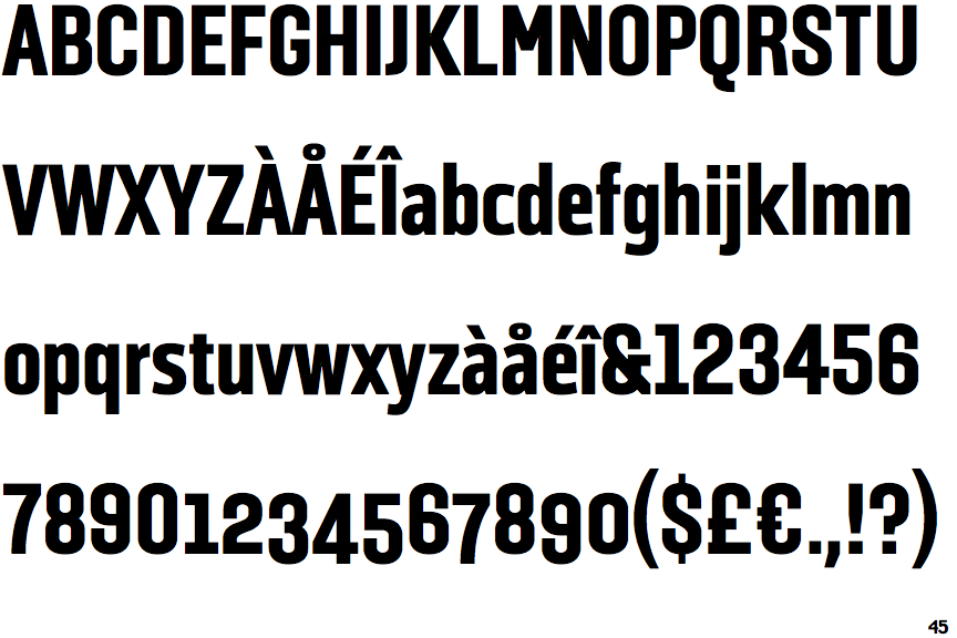
 |
The '&' (ampersand) is traditional style with a gap at the top.
|
 |
The top storey of the '3' is a smooth curve.
|
 |
The 'l' (lower-case 'L') has no serifs or tail.
|
 |
The leg of the upper-case 'R' is curved outwards.
|
 |
The top of the lower-case 'q' has a vertical or slightly angled spur (pointed or flat).
|
 |
The sides of the lower-case 'y' are angled (V-shaped).
|
 |
The lower-case 'i' has no serifs or tail.
|
 |
The tail of the lower-case 'j' is curved with no upper serif.
|
 |
The centre vertex of the upper-case 'W' is level with the outer strokes.
|