Identifont

Fonts by Appearance

Fonts by Name

Fonts by Similarity

Fonts by Picture

Fonts by Designer/Publisher

Differences

TweetTweet Differences

Compare: and  

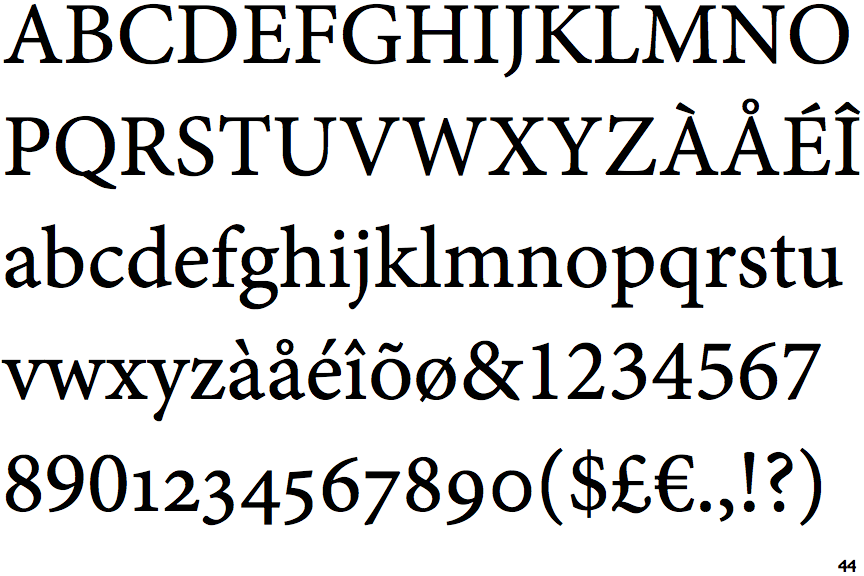
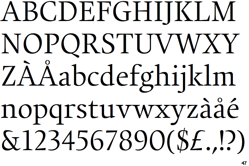
Minion Caption

Minion Caption

Closed
The '&' (ampersand) is traditional style with two enclosed loops.
Sloping
The verticals of the upper-case 'M' are sloping.
Meets
The centre bar of the upper-case 'P' meets the vertical.
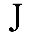
Pointed
The tail of the upper-case 'J' has a tapered end.
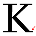
One
The leg of the upper-case 'K' has a single right-pointing serif or foot.

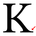
Note that the fonts in the icons shown above represent general examples, not necessarily the two fonts chosen for comparison.

Show Examples
Union

Union

Open
The '&' (ampersand) is traditional style with a gap at the top.
Parallel
The verticals of the upper-case 'M' are parallel.
Gap
The centre bar of the upper-case 'P' leaves a gap with the vertical.
Ball
The tail of the upper-case 'J' has a rounded end or ball.
Two
The leg of the upper-case 'K' has two serifs.