Identifont

Fonts by Appearance

Fonts by Name

Fonts by Similarity

Fonts by Picture

Fonts by Designer/Publisher

Differences

TweetTweet Differences

Compare: and  

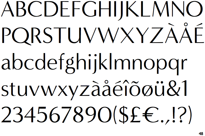
Minerva Modern

Minerva Modern

Touches
The upper-case 'Q' tail touches the circle.
Gap
The centre bar of the upper-case 'P' leaves a gap with the vertical.
Stem
The upper-case 'U' has a stem/serif.
No bar
The upper-case 'G' has no bar.
No gap
The lower storey of the lower-case 'g' has no gap.

Note that the fonts in the icons shown above represent general examples, not necessarily the two fonts chosen for comparison.

Show Examples
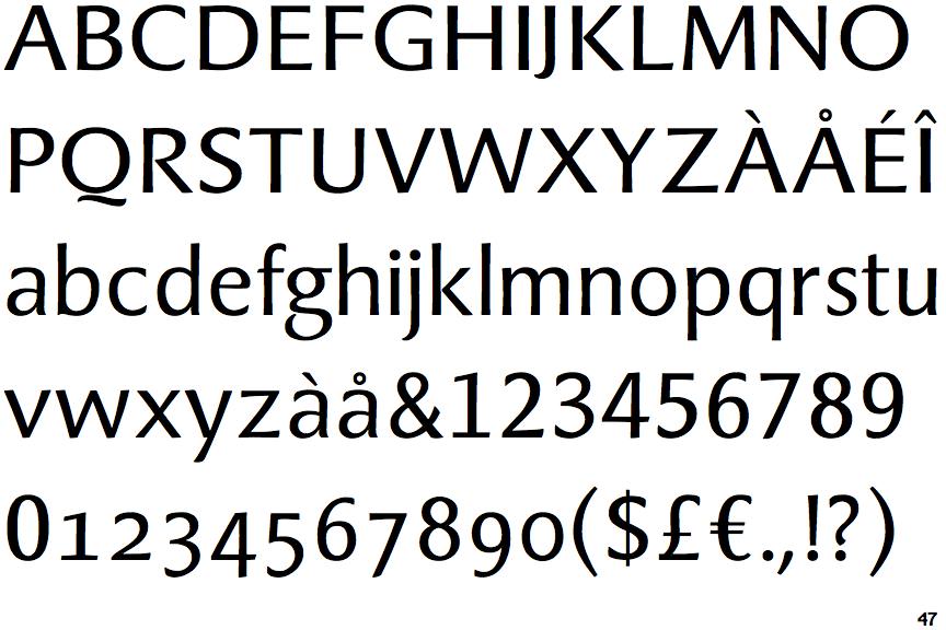
Bravura Pro

Bravura Pro

Below
The upper-case 'Q' tail is below and separated from the circle.
Meets
The centre bar of the upper-case 'P' meets the vertical.
No-Stem
The upper-case 'U' has no stem/serif.
Left
The upper-case 'G' has a bar to the left.
Gap
The lower storey of the lower-case 'g' has a gap.