 |
The diagonal strokes of the upper-case 'K' meet at the vertical (with or without a gap).
|
 |
The upper-case 'G' foot has a downward pointing spur.
|
 |
The lower-case 't' has double-sided bar which forms a right-angle with the vertical.
|
 |
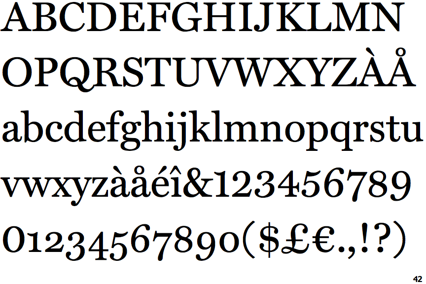
The top serif of the upper-case 'C' is vertical or nearly vertical.
|
 |
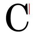
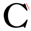
The stem of the lower-case 'a' is vertical or almost vertical.
|
 |
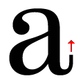
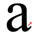
The lower-case 'k' diagonal strokes are straight at the top, curved at the bottom.
|
Note that the fonts in the icons shown above represent general examples, not necessarily the two fonts chosen for comparison.
Show Examples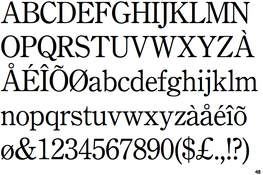
 |
The diagonal strokes of the upper-case 'K' meet in a 'T'.
|
 |
The upper-case 'G' foot has no spur or serif.
|
 |
The lower-case 't' has double-sided bar which forms a diagonal with the vertical.
|
 |
The top serif of the upper-case 'C' is angled left.
|
 |
The stem of the lower-case 'a' is horizontal or angled up.
|
 |
The lower-case 'k' diagonal strokes are both straight.
|