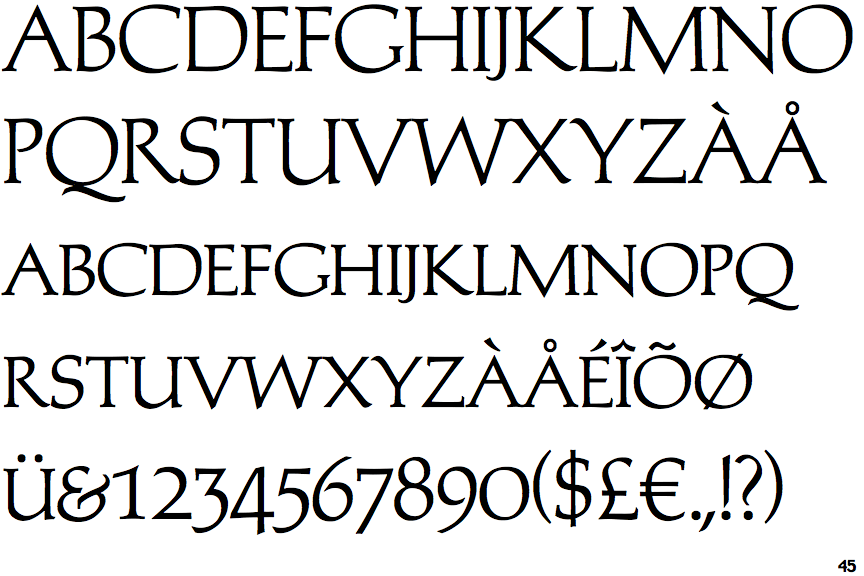
 |
The upper-case 'Q' tail touches the circle.
|
 |
The '&' (ampersand) looks like 'Et' with a gap at the top.
|
 |
The upper-case 'J' descends below the baseline.
|
 |
The dot on the '?' (question-mark) is circular or oval.
|
 |
The top storey of the '3' is a sharp angle.
|
 |
The upper-case 'Y' arms and tail are separate strokes.
|
 |
The top of the upper-case 'W' has three upper terminals.
|
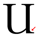 |
The stem of the upper-case "U" has a single-sided serif.
|
 |
The foot of the '£' (pound) has no loop.
|
Note that the fonts in the icons shown above represent general examples, not necessarily the two fonts chosen for comparison.
Show Examples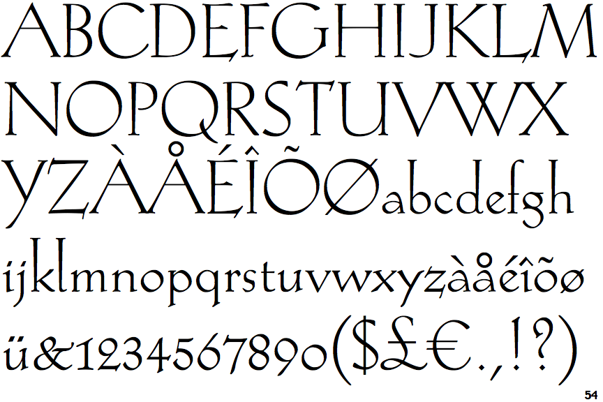
 |
The upper-case 'Q' tail crosses the circle.
|
 |
The '&' (ampersand) is traditional style with two enclosed loops.
|
 |
The upper-case 'J' sits on the baseline.
|
 |
The dot on the '?' (question-mark) is diamond-shaped or triangular.
|
 |
The top storey of the '3' is a smooth curve.
|
 |
The upper-case 'Y' right-hand arm forms a continuous stroke with the tail.
|
 |
The top of the upper-case 'W' has four upper terminals.
|
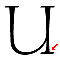 |
The stem of the upper-case "U" has a double-sided serif.
|
 |
The foot of the '£' (pound) has a loop.
|