 |
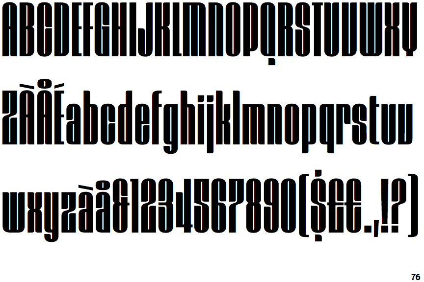
The upper-case 'Q' tail is below and separated from the circle.
|
 |
The '&' (ampersand) looks like 'Et' with one enclosed loop (with or without exit stroke).
|
 |
The centre vertex of the upper-case 'M' is on the baseline.
|
 |
The dot on the '?' (question-mark) is square or rectangular.
|
 |
The top storey of the '3' is a smooth curve.
|
 |
The centre bar of the upper-case 'P' meets the vertical.
|
 |
The upper-case 'Y' arms and tail are separate strokes.
|
 |
The upper-case 'J' has no bar.
|
 |
The leg of the upper-case 'R' is curved outwards.
|
 |
The dot on the lower-case 'i' or 'j' is square or rectangular.
|
There are more than ten differences; only the first ten are shown.
Note that the fonts in the icons shown above represent general examples, not necessarily the two fonts chosen for comparison.
Show Examples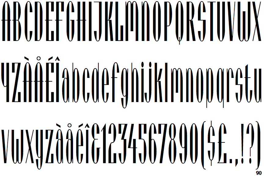
 |
The upper-case 'Q' tail crosses the circle.
|
 |
The '&' (ampersand) looks like 'Et' with a gap at the top.
|
 |
The centre vertex of the upper-case 'M' is above the baseline.
|
 |
The dot on the '?' (question-mark) is circular or oval.
|
 |
The top storey of the '3' is a sharp angle.
|
 |
The centre bar of the upper-case 'P' crosses the vertical.
|
 |
The upper-case 'Y' right-hand arm forms a continuous stroke with the tail.
|
 |
The upper-case 'J' has a bar to the left.
|
 |
The leg of the upper-case 'R' is straight.
|
 |
The dot on the lower-case 'i' or 'j' is circular or oval.
|