Identifont

Fonts by Appearance

Fonts by Name

Fonts by Similarity

Fonts by Picture

Fonts by Designer/Publisher

Differences

TweetTweet Differences

Compare: and  

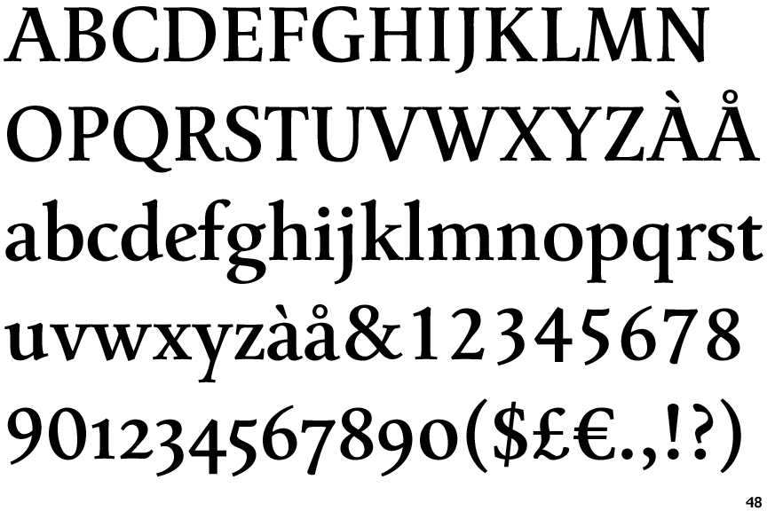
Mengelt Basel Antiqua Bold

Mengelt Basel Antiqua Bold

Sloping
The verticals of the upper-case 'M' are sloping.
Left
The top of the upper-case 'A' has a serif or cusp on the left.
Sloping
The lower-case 'e' has a straight angled bar.
2 serifs
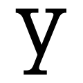
The tail of the lower-case 'y' has serifs on both sides.

Note that the fonts in the icons shown above represent general examples, not necessarily the two fonts chosen for comparison.

Show Examples
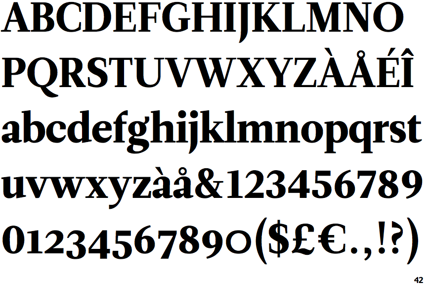
Leitura Roman 4

Leitura Roman 4

Parallel
The verticals of the upper-case 'M' are parallel.
None
The top of the upper-case 'A' has no serifs or cusps.
Horizontal
The lower-case 'e' has a straight horizontal bar.
Cusp
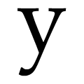
The tail of the lower-case 'y' is curved with a flat end or cusp.