 |
The diagonal strokes of the upper-case 'K' meet in a 'T'.
|
 |
The upper-case 'G' has no bar.
|
 |
The right side of the upper-case 'G' has a flat section.
|
 |
The lower-case 'u' has a stem/serif.
|
 |
The tail of the upper-case 'Q' is slanted.
|
 |
The tail of the lower-case 't' is curved.
|
 |
The tail of the lower-case 'j' is curved with no upper serif.
|
 |
The centre strokes of the upper-case 'W' meet in a T on the left.
|
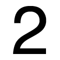 |
The '2' is open.
|
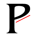 |
The base of the upper-case 'P' bowl is angled up.
|
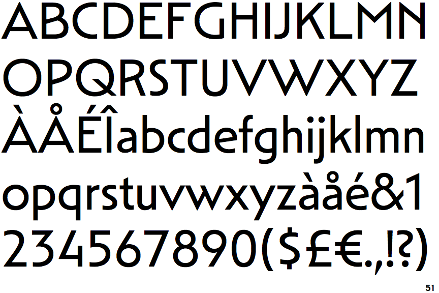
Note that the fonts in the icons shown above represent general examples, not necessarily the two fonts chosen for comparison.
Show Examples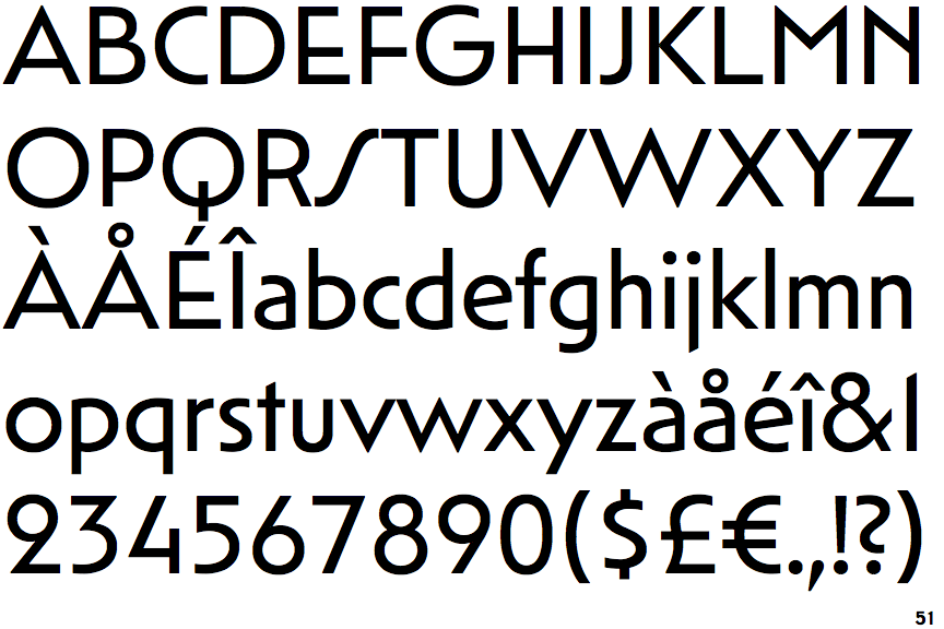
 |
The diagonal strokes of the upper-case 'K' meet at the vertical (with or without a gap).
|
 |
The upper-case 'G' has a bar to the left.
|
 |
The right side of the upper-case 'G' is curved.
|
 |
The lower-case 'u' has no stem/serif.
|
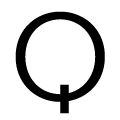 |
The tail of the upper-case 'Q' is vertical.
|
 |
The tail of the lower-case 't' is straight.
|
 |
The tail of the lower-case 'j' is straight with no upper serif.
|
 |
The centre strokes of the upper-case 'W' meet at a vertex.
|
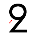 |
The '2' is closed.
|
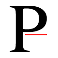 |
The base of the upper-case 'P' bowl is substantially horizontal.
|