 |
The diagonal strokes of the upper-case 'K' meet at the vertical (with or without a gap).
|
 |
The dot on the '?' (question-mark) is circular or oval.
|
 |
The top stroke of the upper-case 'C' has no upward-pointing serif.
|
 |
The centre bar of the upper-case 'E' has serifs.
|
 |
The top of the lower-case 'q' has a vertical or slightly angled spur (pointed or flat).
|
 |
The tail of the upper-case 'J' has a tapered end.
|
 |
The dot on the lower-case 'i' or 'j' is circular or oval.
|
 |
The tail of the upper-case 'Q' is curved, S-shaped, or Z-shaped.
|
 |
The centre bar of the upper-case 'F' has serifs.
|
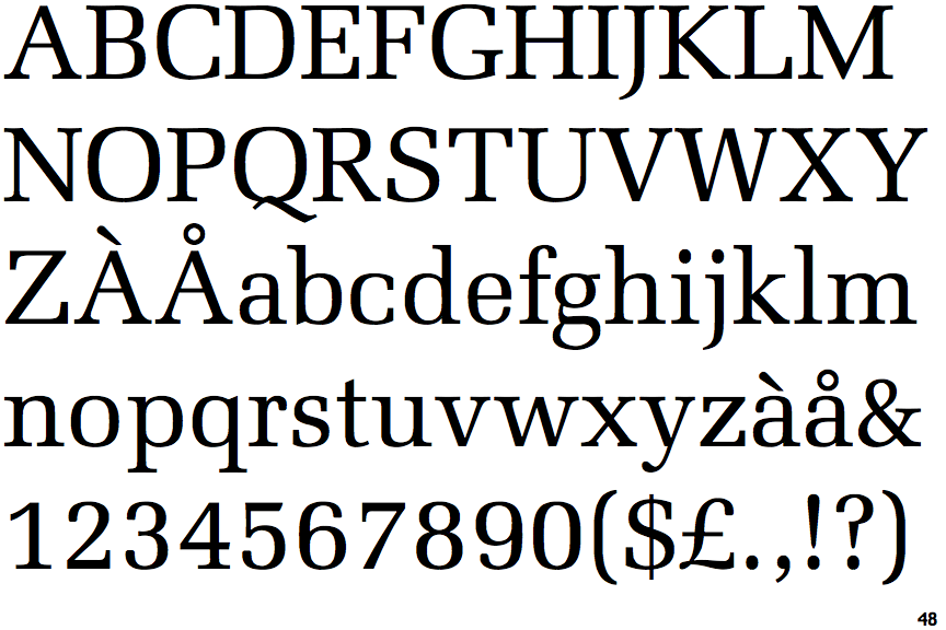
Note that the fonts in the icons shown above represent general examples, not necessarily the two fonts chosen for comparison.
Show Examples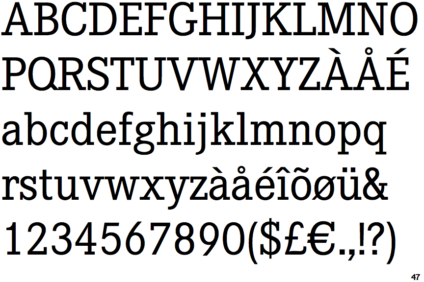
 |
The diagonal strokes of the upper-case 'K' meet in a 'T'.
|
 |
The dot on the '?' (question-mark) is square or rectangular.
|
 |
The top stroke of the upper-case 'C' has a vertical or angled upward-pointing serif.
|
 |
The centre bar of the upper-case 'E' has no serifs.
|
 |
The top of the lower-case 'q' has a right-facing serif.
|
 |
The tail of the upper-case 'J' has a flat end or cusp.
|
 |
The dot on the lower-case 'i' or 'j' is square or rectangular.
|
 |
The tail of the upper-case 'Q' is straight (horizontal, diagonal, or vertical).
|
 |
The centre bar of the upper-case 'F' has no serifs.
|