 |
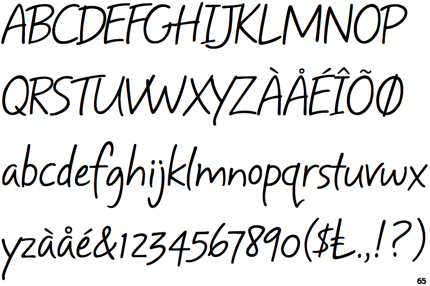
The upper-case 'Q' tail crosses the circle.
|
 |
The upper-case 'U' has a stem/serif.
|
 |
The upper-case 'G' has no spur/tail.
|
 |
The upper-case 'Y' right-hand arm forms a continuous stroke with the tail.
|
 |
The leg of the upper-case 'R' is straight.
|
 |
The sides of the lower-case 'y' are angled (V-shaped).
|
 |
The upper-case letter 'I' has serifs/bars.
|
 |
The lower-case 'i' has no serifs or tail.
|
 |
The upper-case 'I' is a single stroke with serifs.
|
 |
The tail of the lower-case 'y' is substantially straight.
|
There are more than ten differences; only the first ten are shown.
Note that the fonts in the icons shown above represent general examples, not necessarily the two fonts chosen for comparison.
Show Examples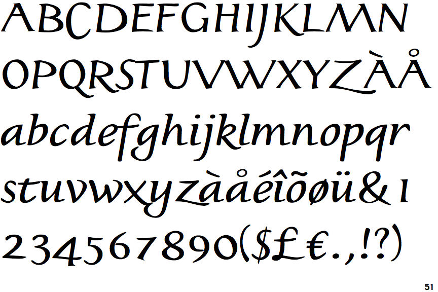
 |
The upper-case 'Q' tail touches the circle.
|
 |
The upper-case 'U' has no stem/serif.
|
 |
The upper-case 'G' has a spur/tail.
|
 |
The upper-case 'Y' arms and tail are separate strokes.
|
 |
The leg of the upper-case 'R' is curved inwards.
|
 |
The sides of the lower-case 'y' are parallel (U-shaped).
|
 |
The upper-case letter 'I' is plain.
|
 |
The lower-case 'i' has a left-facing upper serif and right-facing lower serif or tail.
|
 |
The upper-case 'I' is a single stroke with no serifs.
|
 |
The tail of the lower-case 'y' curves or points to the left without a loop.
|