Identifont

Fonts by Appearance

Fonts by Name

Fonts by Similarity

Fonts by Picture

Fonts by Designer/Publisher

Differences

TweetTweet Differences

Compare: and  

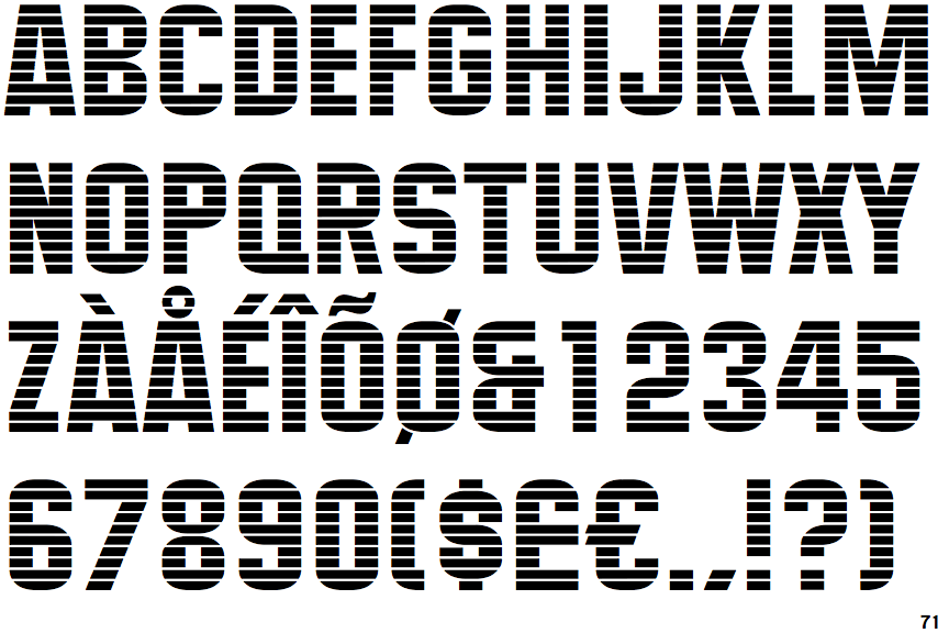
Maximus (BT)

Maximus (BT)

Closed
The '4' is closed.
Baseline
The centre vertex of the upper-case 'M' is on the baseline.
Plain
The upper-case 'J' has no bar.
Tapered
The upper-case 'A' has tapered verticals.
Plain
The upper-case letter 'I' is plain.

Note that the fonts in the icons shown above represent general examples, not necessarily the two fonts chosen for comparison.

Show Examples
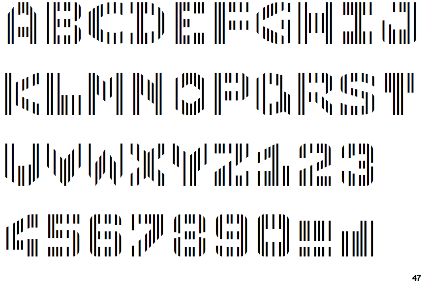
Linotype CMC-7

Linotype CMC-7

Open
The '4' is open.
Above
The centre vertex of the upper-case 'M' is above the baseline.
Single-bar
The upper-case 'J' has a bar to the left.
Parallel
The upper-case 'A' has parallel verticals.
Serifs
The upper-case letter 'I' has serifs/bars.