Identifont

Fonts by Appearance

Fonts by Name

Fonts by Similarity

Fonts by Picture

Fonts by Designer/Publisher

Differences

TweetTweet Differences

Compare: and  

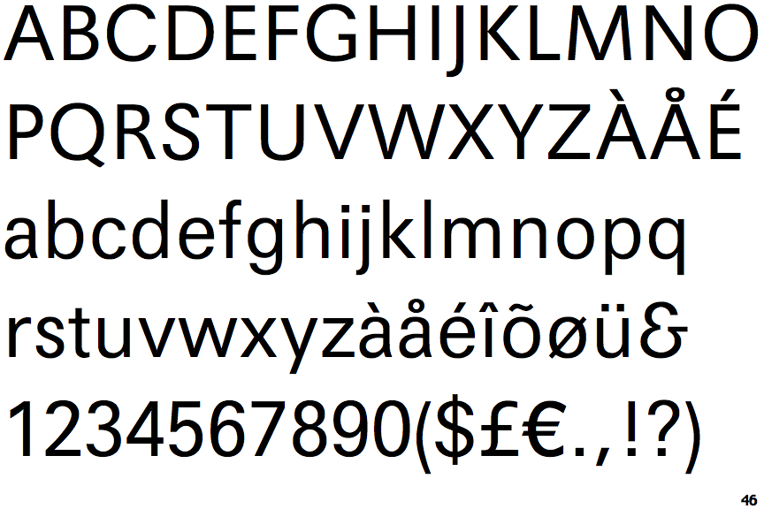
Maxima Light

Maxima Light

Gap top
The '&' (ampersand) looks like 'Et' with a gap at the top.
Below
The upper-case 'J' descends below the baseline.
Sloping
The verticals of the upper-case 'M' are sloping.

Note that the fonts in the icons shown above represent general examples, not necessarily the two fonts chosen for comparison.

Show Examples
Univers

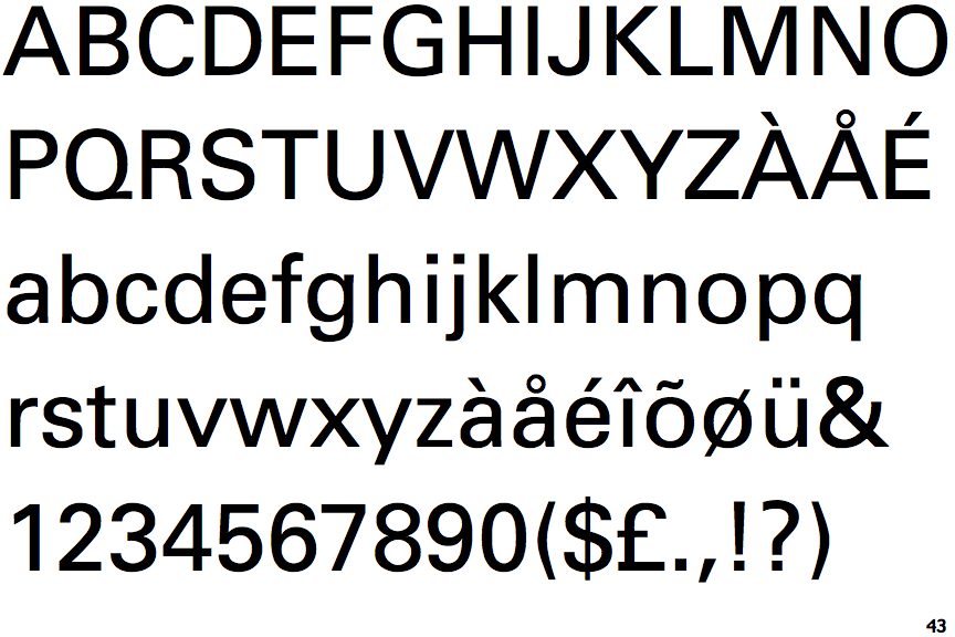
Univers

Closed
The '&' (ampersand) is traditional style with two enclosed loops.
On
The upper-case 'J' sits on the baseline.
Parallel
The verticals of the upper-case 'M' are parallel.