 |
The '&' (ampersand) is traditional style with a gap at the top.
|
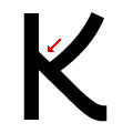 |
The diagonal strokes of the upper-case 'K' meet in an inverted 'T'.
|
 |
The upper-case 'G' has no bar.
|
 |
The upper-case 'Y' right-hand arm forms a continuous stroke with the tail.
|
 |
The 'l' (lower-case 'L') has a right-facing lower serif or tail.
|
 |
The upper-case 'J' has a bar to the left.
|
 |
The leg of the upper-case 'R' is straight.
|
 |
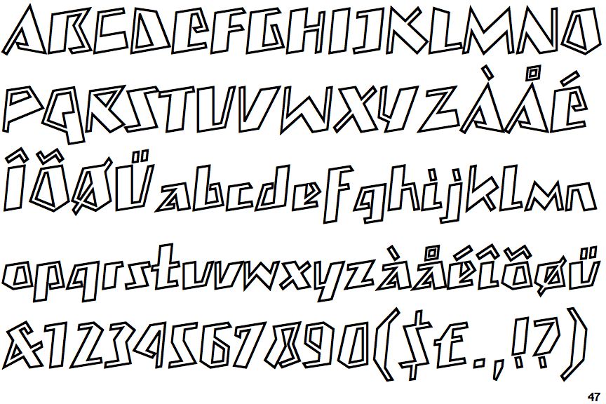
The strokes are sloped right (italic, oblique, or cursive).
|
 |
The dot on the lower-case 'i' or 'j' is square or rectangular.
|
 |
The bar of the lower-case 'f' is single-sided.
|
There are more than ten differences; only the first ten are shown.
Note that the fonts in the icons shown above represent general examples, not necessarily the two fonts chosen for comparison.
Show Examples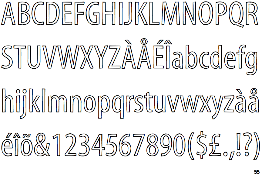
 |
The '&' (ampersand) is traditional style with two enclosed loops.
|
 |
The diagonal strokes of the upper-case 'K' meet in a 'T'.
|
 |
The upper-case 'G' has a bar to the left.
|
 |
The upper-case 'Y' arms and tail are separate strokes.
|
 |
The 'l' (lower-case 'L') has no serifs or tail.
|
 |
The upper-case 'J' has no bar.
|
 |
The leg of the upper-case 'R' is curved outwards.
|
 |
The strokes are upright.
|
 |
The dot on the lower-case 'i' or 'j' is circular or oval.
|
 |
The bar of the lower-case 'f' is double-sided.
|