 |
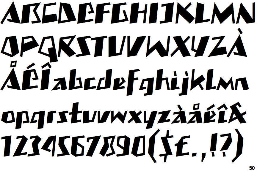
The '$' (dollar) has a single line which does not cross the 'S'.
|
 |
The '&' (ampersand) is traditional style with a gap at the top.
|
 |
The verticals of the upper-case 'M' are sloping.
|
 |
The lower-case 'g' is single-storey (with or without loop).
|
 |
The upper-case 'G' has no bar.
|
 |
The upper-case 'Y' right-hand arm forms a continuous stroke with the tail.
|
 |
The upper-case 'J' has a bar to the left.
|
 |
The strokes are sloped right (italic, oblique, or cursive).
|
 |
The dot on the lower-case 'i' or 'j' is square or rectangular.
|
 |
The bar of the lower-case 'f' is single-sided.
|
There are more than ten differences; only the first ten are shown.
Note that the fonts in the icons shown above represent general examples, not necessarily the two fonts chosen for comparison.
Show Examples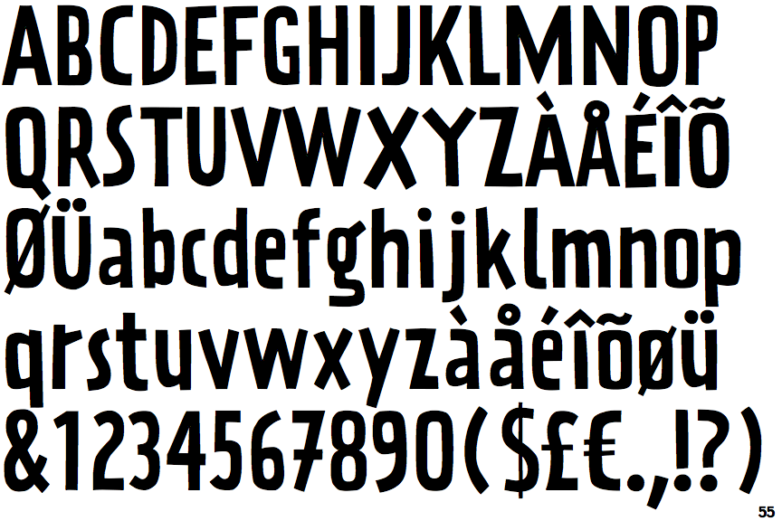
 |
The '$' (dollar) has a single line crossing the 'S'.
|
 |
The '&' (ampersand) is traditional style with two enclosed loops.
|
 |
The verticals of the upper-case 'M' are parallel.
|
 |
The lower-case 'g' is double-storey (with or without gap).
|
 |
The upper-case 'G' has a bar to the left.
|
 |
The upper-case 'Y' arms and tail are separate strokes.
|
 |
The upper-case 'J' has no bar.
|
 |
The strokes are upright.
|
 |
The dot on the lower-case 'i' or 'j' is circular or oval.
|
 |
The bar of the lower-case 'f' is double-sided.
|