 |
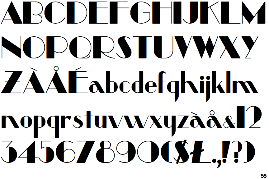
The '$' (dollar) has a single line crossing the 'S'.
|
 |
The '&' (ampersand) is traditional style with two enclosed loops.
|
 |
The characters are solid.
|
 |
The upper-case 'Y' right-hand arm forms a continuous stroke with the tail.
|
 |
The leg of the upper-case 'R' is curved inwards.
|
 |
The right side of the upper-case 'G' has a flat section.
|
 |
The '7' has no bar.
|
 |
The centre strokes of the upper-case 'W' meet at a vertex.
|
Note that the fonts in the icons shown above represent general examples, not necessarily the two fonts chosen for comparison.
Show Examples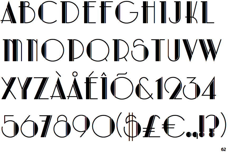
 |
The '$' (dollar) has a double line crossing the 'S'.
|
 |
The '&' (ampersand) is traditional style with a gap at the top.
|
 |
The characters are outlined, shaded, or filled with a pattern.
|
 |
The upper-case 'Y' arms and tail are separate strokes.
|
 |
The leg of the upper-case 'R' is straight.
|
 |
The right side of the upper-case 'G' is curved.
|
 |
The '7' has a bar.
|
 |
The centre strokes of the upper-case 'W' meet in a T on the left.
|