 |
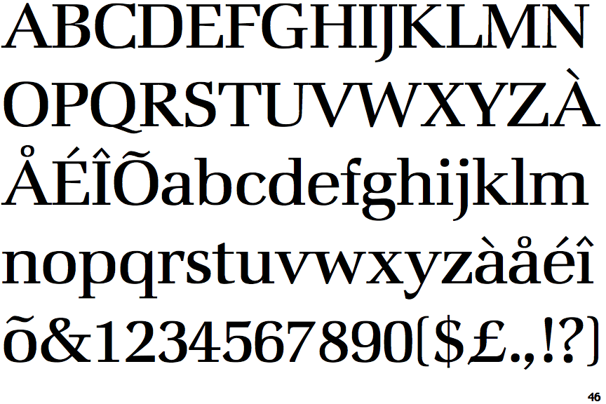
The verticals of the upper-case 'M' are parallel.
|
 |
The top stroke of the upper-case 'C' has a vertical or angled upward-pointing serif.
|
 |
The centre bar of the upper-case 'E' has no serifs.
|
 |
The upper-case 'G' foot has a downward pointing spur.
|
 |
The foot of the '4' has double-sided serifs.
|
 |
The tail of the upper-case 'J' has a tapered end.
|
 |
The centre vertex of the upper-case 'W' has no serifs.
|
 |
The lower-case 'e' has a straight horizontal bar.
|
 |
The centre bar of the upper-case 'F' has no serifs.
|
 |
The foot of the '£' (pound) has no loop.
|
Note that the fonts in the icons shown above represent general examples, not necessarily the two fonts chosen for comparison.
Show Examples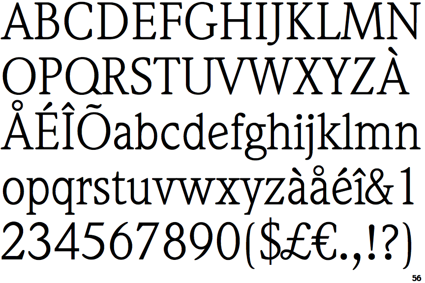
 |
The verticals of the upper-case 'M' are sloping.
|
 |
The top stroke of the upper-case 'C' has no upward-pointing serif.
|
 |
The centre bar of the upper-case 'E' has serifs.
|
 |
The upper-case 'G' foot has no spur or serif.
|
 |
The foot of the '4' has no serifs.
|
 |
The tail of the upper-case 'J' has a rounded end or ball.
|
 |
The centre vertex of the upper-case 'W' has two separate serifs.
|
 |
The lower-case 'e' has a straight angled bar.
|
 |
The centre bar of the upper-case 'F' has serifs.
|
 |
The foot of the '£' (pound) has a loop.
|