 |
The diagonal strokes of the upper-case 'K' meet in a 'T'.
|
 |
The centre bar of the upper-case 'P' leaves a gap with the vertical.
|
 |
The centre bar of the upper-case 'R' meets the vertical.
|
 |
The sides of the lower-case 'y' are parallel (U-shaped).
|
 |
The bar of the upper-case 'G' is single-sided, left-facing.
|
 |
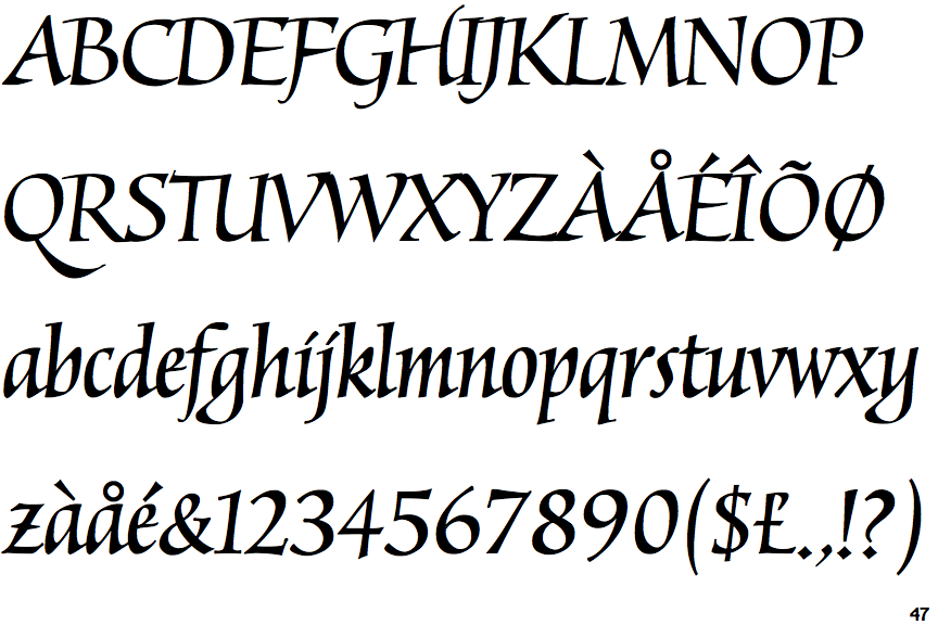
The lower-case 'z' is single-storey with a bar.
|
 |
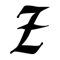
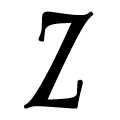
The upper-case 'Z' has no bar.
|
Note that the fonts in the icons shown above represent general examples, not necessarily the two fonts chosen for comparison.
Show Examples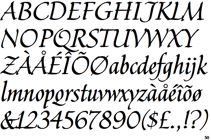
 |
The diagonal strokes of the upper-case 'K' meet at the vertical (with or without a gap).
|
 |
The centre bar of the upper-case 'P' meets the vertical.
|
 |
The centre bar of the upper-case 'R' leaves a gap with the vertical.
|
 |
The sides of the lower-case 'y' are angled (V-shaped).
|
 |
The bar of the upper-case 'G' is double-sided.
|
 |
The lower-case 'z' is single-storey without a bar.
|
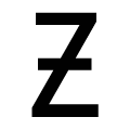 |
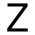
The upper-case 'Z' has a single bar.
|