 |
The '$' (dollar) has a single line which does not cross the 'S'.
|
 |
The '&' (ampersand) looks like 'Et' with a gap at the top.
|
 |
The dot on the '?' (question-mark) is square or rectangular.
|
 |
The top storey of the '3' is a smooth curve.
|
 |
The centre bar of the upper-case 'P' leaves a gap with the vertical.
|
 |
The upper-case 'U' has no stem/serif.
|
 |
The centre bar of the upper-case 'E' has serifs.
|
 |
The centre bar of the upper-case 'R' leaves a gap with the vertical.
|
 |
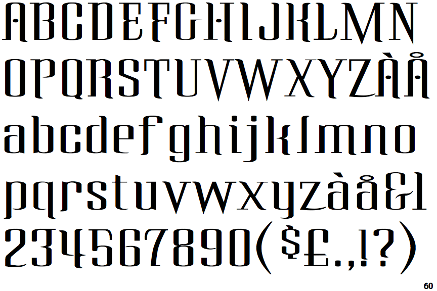
The foot of the '4' has a single right-facing serif.
|
 |
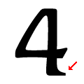
The bar of the upper-case 'G' is single-sided, right-facing.
|
There are more than ten differences; only the first ten are shown.
Note that the fonts in the icons shown above represent general examples, not necessarily the two fonts chosen for comparison.
Show Examples
 |
The '$' (dollar) has a single line crossing the 'S'.
|
 |
The '&' (ampersand) looks like 'Et' with one enclosed loop (with or without exit stroke).
|
 |
The dot on the '?' (question-mark) is circular or oval.
|
 |
The top storey of the '3' is a sharp angle.
|
 |
The centre bar of the upper-case 'P' meets the vertical.
|
 |
The upper-case 'U' has a stem/serif.
|
 |
The centre bar of the upper-case 'E' has no serifs.
|
 |
The centre bar of the upper-case 'R' meets the vertical.
|
 |
The foot of the '4' has no serifs.
|
 |
The bar of the upper-case 'G' is single-sided, left-facing.
|