 |
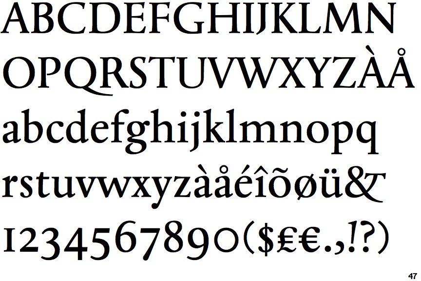
The upper-case 'J' sits on the baseline.
|
 |
The verticals of the upper-case 'M' are sloping.
|
 |
The centre bar of the upper-case 'E' has serifs.
|
 |
The foot of the '4' has no serifs.
|
 |
The centre vertex of the upper-case 'W' has two separate serifs.
|
 |
The lower storey of the lower-case 'g' has a gap.
|
 |
The centre bar of the upper-case 'F' has serifs.
|
 |
The top vertices of the upper-case 'M' have no top serifs.
|
Note that the fonts in the icons shown above represent general examples, not necessarily the two fonts chosen for comparison.
Show Examples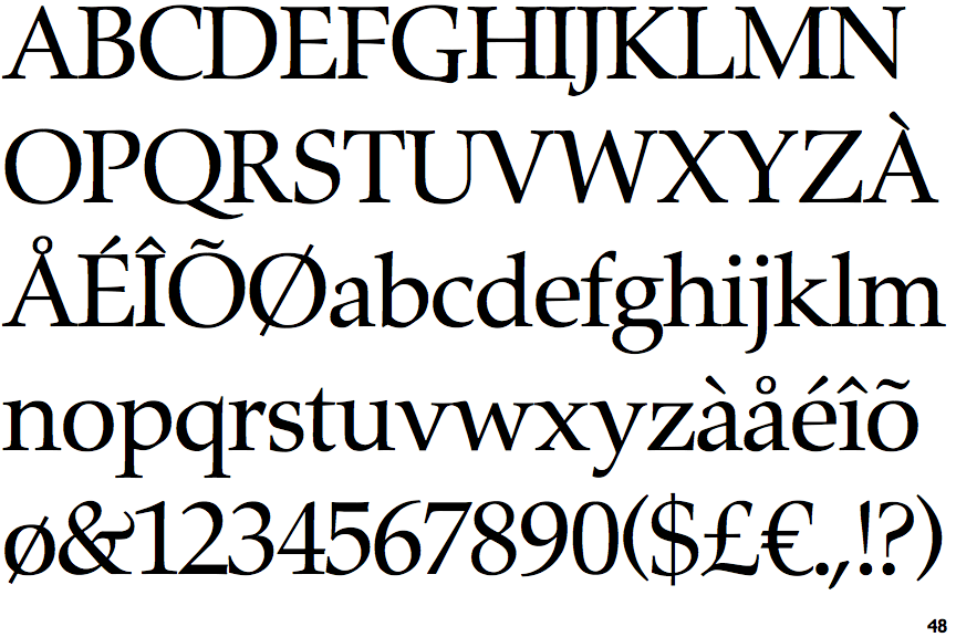
 |
The upper-case 'J' descends below the baseline.
|
 |
The verticals of the upper-case 'M' are parallel.
|
 |
The centre bar of the upper-case 'E' has no serifs.
|
 |
The foot of the '4' has double-sided serifs.
|
 |
The centre vertex of the upper-case 'W' has no serifs.
|
 |
The lower storey of the lower-case 'g' has no gap.
|
 |
The centre bar of the upper-case 'F' has no serifs.
|
 |
The top vertices of the upper-case 'M' have symmetrical single-sided serifs.
|