 |
The '&' (ampersand) is traditional style with a gap at the top.
|
 |
The characters do not have serifs.
|
 |
The diagonal strokes of the upper-case 'K' meet at the vertical (with or without a gap).
|
 |
The '1' (digit one) has no base.
|
 |
The top of the '7' has no serif or bar.
|
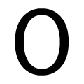 |
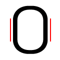
The verticals of the upper-case letter 'O' are fully curved.
|
 |
The verticals of the digit '0' are fully curved.
|
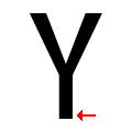 |
The upper-case 'Y' has no pedestal.
|
Note that the fonts in the icons shown above represent general examples, not necessarily the two fonts chosen for comparison.
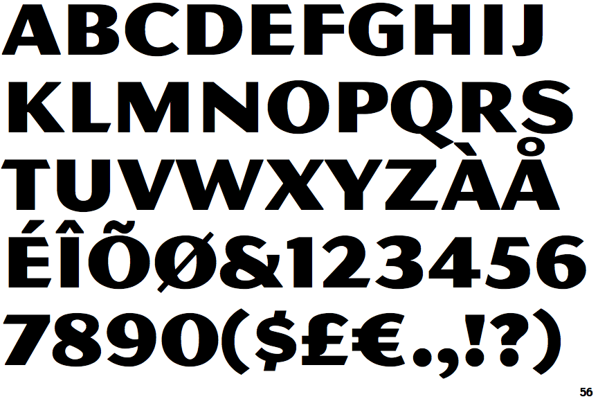
Show Examples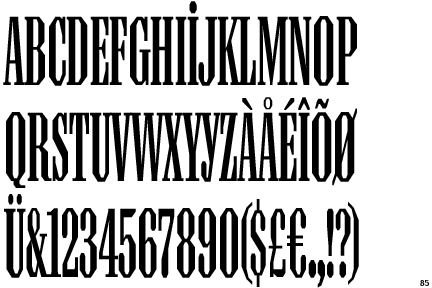
 |
The '&' (ampersand) is traditional style with two enclosed loops.
|
 |
The characters have serifs.
|
 |
The diagonal strokes of the upper-case 'K' meet in a 'T'.
|
 |
The '1' (digit one) has double-sided base or serifs.
|
 |
The top of the '7' has a downward-pointing serif or bar.
|
 |
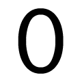
The verticals of the upper-case letter 'O' have straight segments.
|
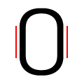 |
The verticals of the digit '0' have straight segments.
|
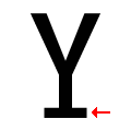 |
The upper-case 'Y' has a pedestal.
|