Identifont

Fonts by Appearance

Fonts by Name

Fonts by Similarity

Fonts by Picture

Fonts by Designer/Publisher

Differences

TweetTweet Differences

Compare: and  

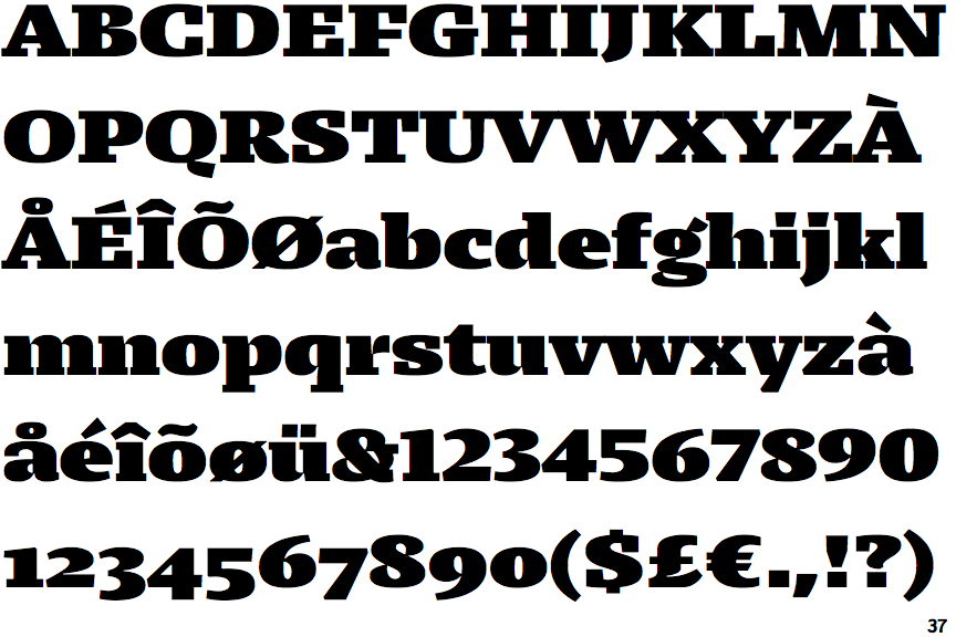
Lumin Display Black Extended

Lumin Display Black Extended

Baseline
The centre vertex of the upper-case 'M' is on the baseline.
Round
The top storey of the '3' is a smooth curve.
No top serif
The top stroke of the upper-case 'C' has no upward-pointing serif.
None
The foot of the '4' has no serifs.

Note that the fonts in the icons shown above represent general examples, not necessarily the two fonts chosen for comparison.

Show Examples
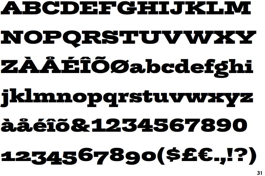
Trilogy Egyptian Heavy Expanded

Trilogy Egyptian Heavy Expanded

Above
The centre vertex of the upper-case 'M' is above the baseline.
Angled
The top storey of the '3' is a sharp angle.
Top serif
The top stroke of the upper-case 'C' has a vertical or angled upward-pointing serif.
Double
The foot of the '4' has double-sided serifs.