 |
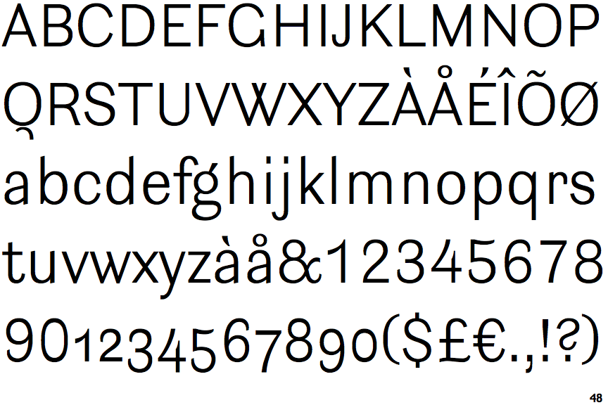
The upper-case 'Q' tail is below and separated from the circle.
|
 |
The '4' is open.
|
 |
The top storey of the '3' is a smooth curve.
|
 |
The upper-case 'G' has no bar.
|
 |
The top of the upper-case 'W' has four upper terminals.
|
 |
The foot of the '£' (pound) has no loop.
|
Note that the fonts in the icons shown above represent general examples, not necessarily the two fonts chosen for comparison.
Show Examples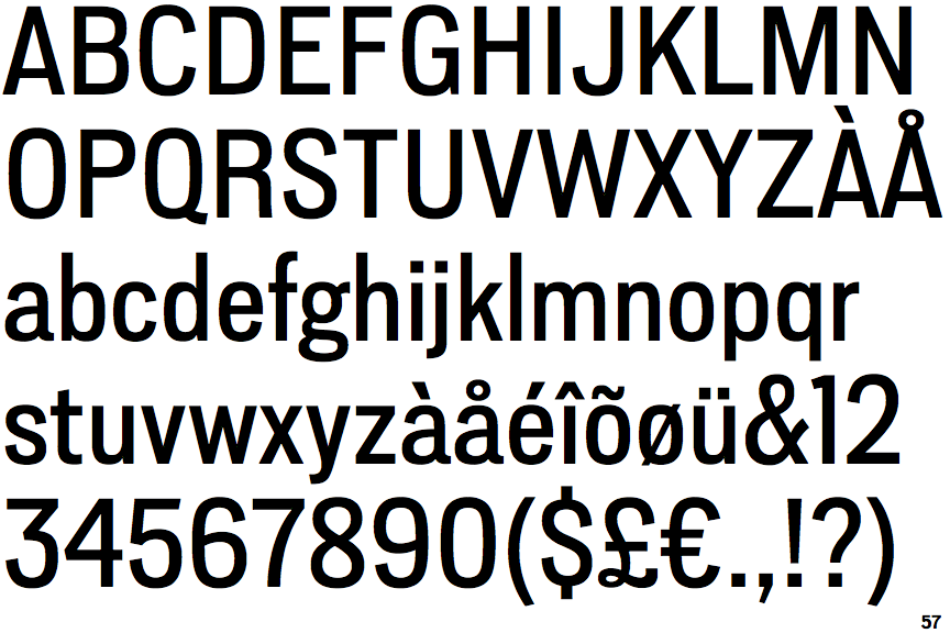
 |
The upper-case 'Q' tail touches the circle.
|
 |
The '4' is closed.
|
 |
The top storey of the '3' is a sharp angle.
|
 |
The upper-case 'G' has a bar to the left.
|
 |
The top of the upper-case 'W' has three upper terminals.
|
 |
The foot of the '£' (pound) has a loop.
|