Identifont

Fonts by Appearance

Fonts by Name

Fonts by Similarity

Fonts by Picture

Fonts by Designer/Publisher

Differences

TweetTweet Differences

Compare: and  

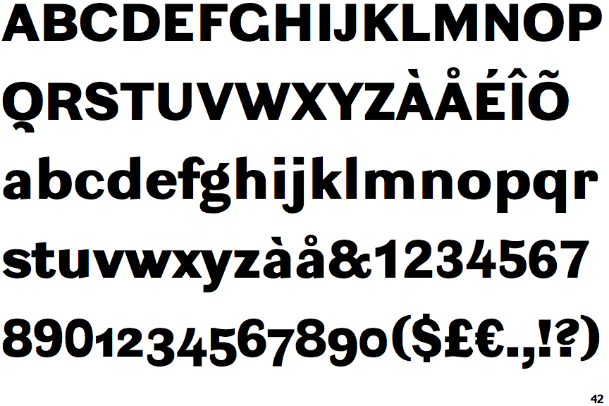
Ludwig Extra Black

Ludwig Extra Black

Below
The upper-case 'Q' tail is below and separated from the circle.
Open
The '4' is open.
No bar
The upper-case 'G' has no bar.
Outwards
The leg of the upper-case 'R' is curved outwards.
Stepped-Left
The centre strokes of the upper-case 'W' meet in a T on the left.

Note that the fonts in the icons shown above represent general examples, not necessarily the two fonts chosen for comparison.

Show Examples
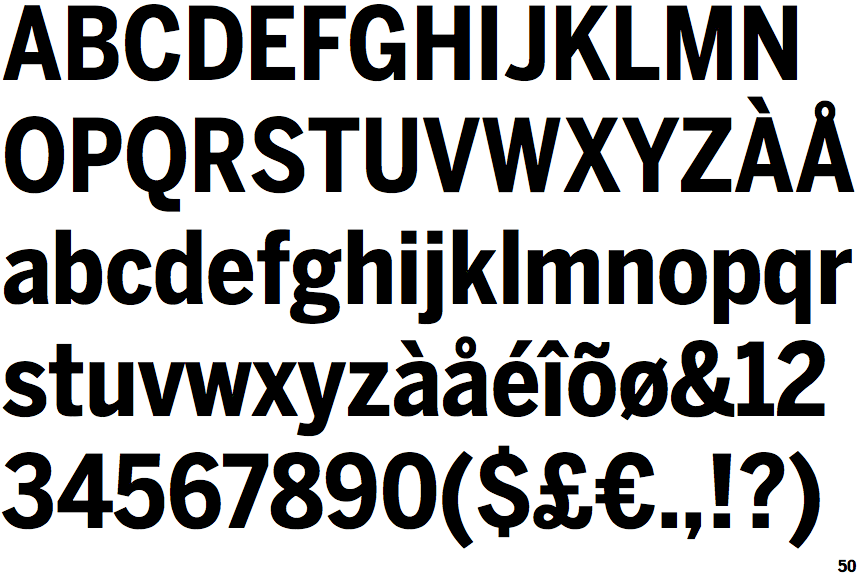
Benton Sans Condensed Bold

Benton Sans Condensed Bold

Touches
The upper-case 'Q' tail touches the circle.
Closed
The '4' is closed.
Left
The upper-case 'G' has a bar to the left.
Straight
The leg of the upper-case 'R' is straight.
Vertex
The centre strokes of the upper-case 'W' meet at a vertex.