 |
The upper-case 'J' descends below the baseline.
|
 |
The verticals of the upper-case 'M' are parallel.
|
 |
The lower-case 'g' is single-storey (with or without loop).
|
 |
The tail of the upper-case 'Q' is curved, S-shaped, or Z-shaped.
|
 |
The tail of the lower-case 'y' is substantially straight.
|
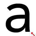 |
The stem of the lower-case 'a' is straight.
|
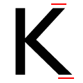 |
The ends of the upper-case 'K' strokes are both horizontal.
|
Note that the fonts in the icons shown above represent general examples, not necessarily the two fonts chosen for comparison.
Show Examples
 |
The upper-case 'J' sits on the baseline.
|
 |
The verticals of the upper-case 'M' are sloping.
|
 |
The lower-case 'g' is double-storey (with or without gap).
|
 |
The tail of the upper-case 'Q' is straight (horizontal, diagonal, or vertical).
|
 |
The tail of the lower-case 'y' is curved or U-shaped to the left.
|
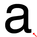 |
The stem of the lower-case 'a' is curved.
|
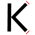 |
The ends of the upper-case 'K' strokes are both angled.
|