 |
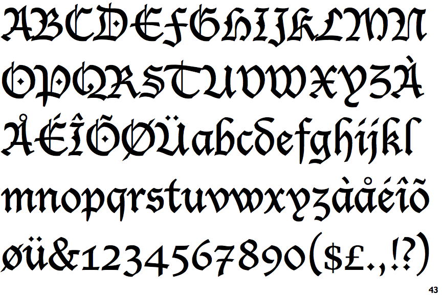
The sides of the lower-case 'y' are angled (V-shaped).
|
 |
The '7' has a bar.
|
 |
The upper-case 'L' has no loops.
|
 |
The upper-case 'I' is a single stroke with serifs.
|
 |
The upper-case 'A' bar is drawn as a separate stroke and no flourish on top.
|
Note that the fonts in the icons shown above represent general examples, not necessarily the two fonts chosen for comparison.
Show Examples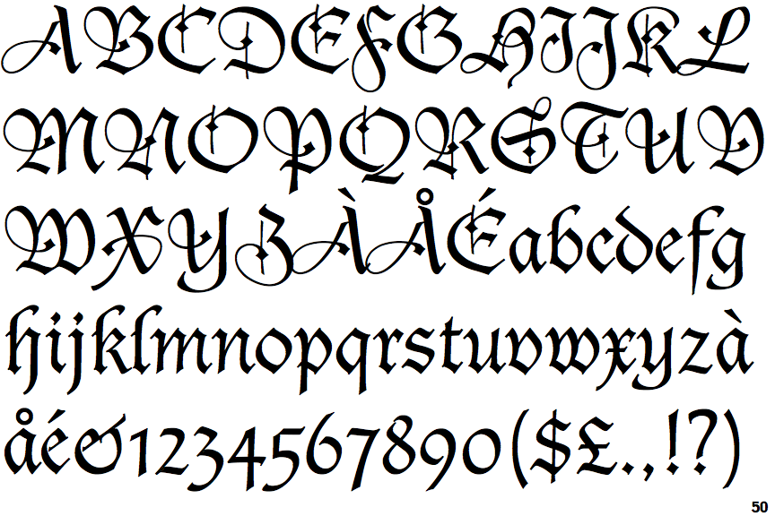
 |
The sides of the lower-case 'y' are parallel (U-shaped).
|
 |
The '7' has no bar.
|
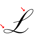 |
The upper-case 'L' has one upper and one lower loop.
|
 |
The upper-case 'I' is a stroke with a flourish on top - not closed.
|
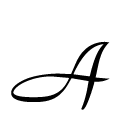 |
The upper-case 'A' left-hand vertical loops to form the bar.
|