 |
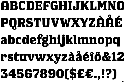
The upper-case 'Q' tail touches the circle.
|
 |
The centre vertex of the upper-case 'M' is above the baseline.
|
 |
The top storey of the '3' is a sharp angle.
|
 |
The centre bar of the upper-case 'P' meets the vertical.
|
 |
The top of the upper-case 'A' has no serifs or cusps.
|
 |
The top stroke of the upper-case 'C' has a vertical or angled upward-pointing serif.
|
 |
The centre bar of the upper-case 'E' has serifs.
|
 |
The upper-case 'A' has parallel verticals.
|
 |
The centre bar of the upper-case 'F' has serifs.
|
Note that the fonts in the icons shown above represent general examples, not necessarily the two fonts chosen for comparison.
Show Examples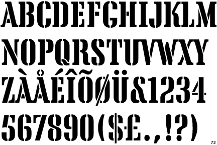
 |
The upper-case 'Q' tail crosses the circle.
|
 |
The centre vertex of the upper-case 'M' is on the baseline.
|
 |
The top storey of the '3' is a smooth curve.
|
 |
The centre bar of the upper-case 'P' leaves a gap with the vertical.
|
 |
The top of the upper-case 'A' has a serif or cusp on the left.
|
 |
The top stroke of the upper-case 'C' has no upward-pointing serif.
|
 |
The centre bar of the upper-case 'E' has no serifs.
|
 |
The upper-case 'A' has tapered verticals.
|
 |
The centre bar of the upper-case 'F' has no serifs.
|