 |
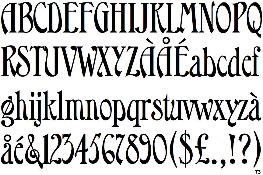
The upper-case 'J' sits on the baseline.
|
 |
The characters have serifs.
|
 |
The verticals of the upper-case 'M' are sloping.
|
 |
The lower-case 'g' is double-storey (with or without gap).
|
 |
The lower-case 'a' stem curves over the top of the bowl (double storey).
|
 |
The sides of the lower-case 'y' are angled (V-shaped).
|
 |
The foot of the '£' (pound) has no loop.
|
Note that the fonts in the icons shown above represent general examples, not necessarily the two fonts chosen for comparison.
Show Examples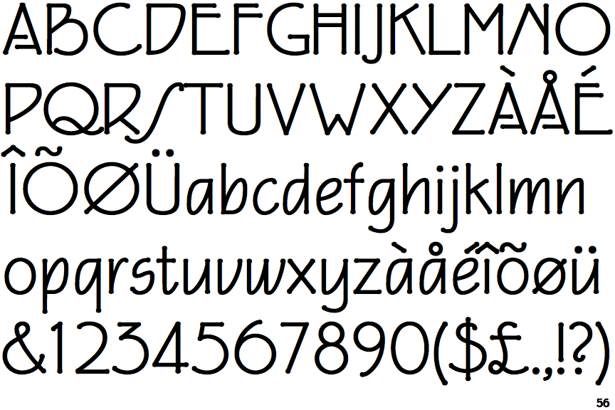
 |
The upper-case 'J' descends below the baseline.
|
 |
The characters do not have serifs.
|
 |
The verticals of the upper-case 'M' are parallel.
|
 |
The lower-case 'g' is single-storey (with or without loop).
|
 |
The lower-case 'a' stem stops at the top of the bowl (single storey).
|
 |
The sides of the lower-case 'y' are parallel (U-shaped).
|
 |
The foot of the '£' (pound) has a loop.
|