 |
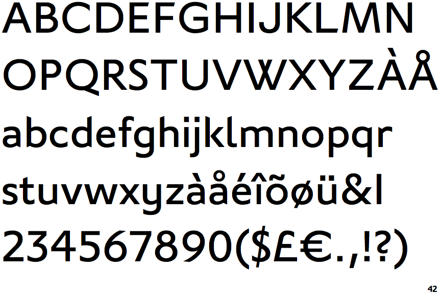
The upper-case 'J' sits on the baseline.
|
 |
The '4' is closed.
|
 |
The centre vertex of the upper-case 'M' is on the baseline.
|
 |
The verticals of the upper-case 'M' are sloping.
|
 |
The top storey of the '3' is a sharp angle.
|
 |
The lower-case 'a' stem curves over the top of the bowl (double storey).
|
 |
The leg of the upper-case 'R' is straight.
|
 |
The top of the upper-case 'W' has four upper terminals.
|
Note that the fonts in the icons shown above represent general examples, not necessarily the two fonts chosen for comparison.
Show Examples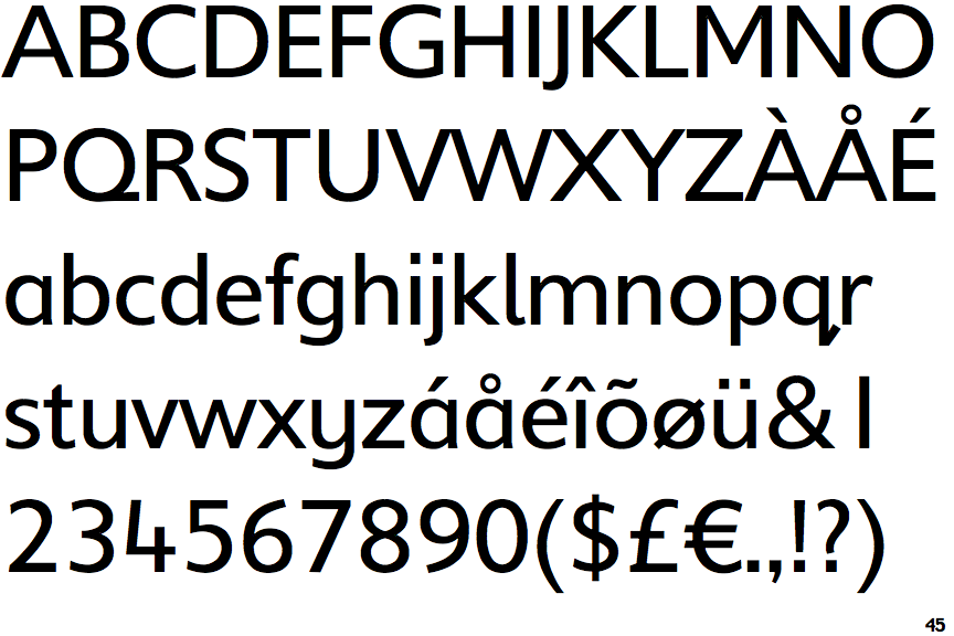
 |
The upper-case 'J' descends below the baseline.
|
 |
The '4' is open.
|
 |
The centre vertex of the upper-case 'M' is above the baseline.
|
|
The verticals of the upper-case 'M' are parallel.
|
 |
The top storey of the '3' is a smooth curve.
|
 |
The lower-case 'a' stem stops at the top of the bowl (single storey).
|
 |
The leg of the upper-case 'R' is curved outwards.
|
 |
The top of the upper-case 'W' has three upper terminals.
|