 |
The dot on the '?' (question-mark) is circular or oval.
|
 |
The centre bar of the upper-case 'P' meets the vertical.
|
 |
The top of the upper-case 'W' has three upper terminals.
|
 |
The tail of the upper-case 'Q' is straight.
|
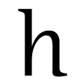 |
The feet of the lower-case 'h' have no serifs on the left and one on the right.
|
 |
The feet of the lower-case 'm' have two serifs on the left, and one on the centre and right.
|
 |
The top stroke of the upper-case 'S' has a vertical or angled upward-pointing serif.
|
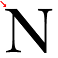 |
The top-left vertex of the upper-case 'N' has one serif.
|
 |
The foot of the '£' (pound) has no loop.
|
Note that the fonts in the icons shown above represent general examples, not necessarily the two fonts chosen for comparison.
Show Examples
 |
The dot on the '?' (question-mark) is diamond-shaped or triangular.
|
 |
The centre bar of the upper-case 'P' leaves a gap with the vertical.
|
 |
The top of the upper-case 'W' has four upper terminals.
|
 |
The tail of the upper-case 'Q' is curved or S-shaped.
|
 |
The feet of the lower-case 'h' have two serifs on the left and one on the right.
|
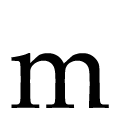 |
The feet of the lower-case 'm' have two serifs on the left and centre and one on the right.
|
 |
The top stroke of the upper-case 'S' has no upward-pointing serif.
|
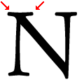 |
The top-left vertex of the upper-case 'N' has two serifs.
|
 |
The foot of the '£' (pound) has a loop.
|