 |
The centre bar of the upper-case 'P' crosses the vertical.
|
 |
The lower-case 'a' stem stops at the top of the bowl (single storey).
|
 |
The '7' has a bar.
|
 |
The tail of the lower-case 'f' descends below the baseline.
|
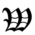 |
The strokes of the upper-case 'W' are like three closing-brackets ')))'.
|
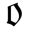 |
The lower-case 'o' is D-shaped, straight-sided on left (Fraktur).
|
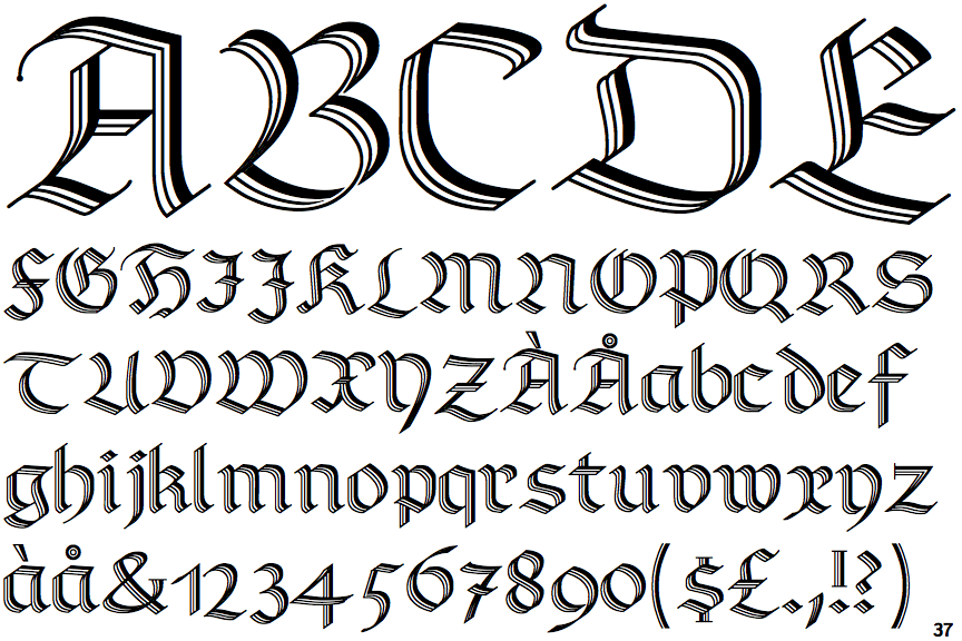
Note that the fonts in the icons shown above represent general examples, not necessarily the two fonts chosen for comparison.
Show Examples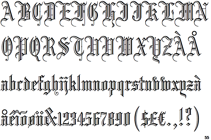
 |
The centre bar of the upper-case 'P' meets the vertical.
|
 |
The lower-case 'a' stem curves over the top of the bowl (double storey).
|
 |
The '7' has no bar.
|
 |
The tail of the lower-case 'f' sits on the baseline.
|
 |
The strokes of the upper-case 'W' are like three vertical bars '|||'.
|
 |
The lower-case 'o' is hexagonal, with straight sides (Textura or Gotisch).
|