 |
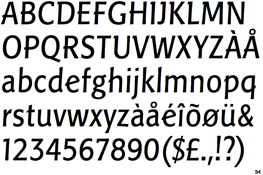
The '$' (dollar) has a single line crossing the 'S'.
|
 |
The centre vertex of the upper-case 'M' is above the baseline.
|
 |
The top storey of the '3' is a sharp angle.
|
 |
The centre bar of the upper-case 'P' crosses the vertical.
|
 |
The lower-case 'g' is double-storey (with or without gap).
|
 |
The upper-case 'J' has a bar to the left.
|
 |
The leg of the upper-case 'R' is straight.
|
 |
The centre bar of the upper-case 'R' crosses the vertical.
|
 |
The strokes are sloped right (italic, oblique, or cursive).
|
 |
The lower-case 'e' has a straight angled bar.
|
There are more than ten differences; only the first ten are shown.
Note that the fonts in the icons shown above represent general examples, not necessarily the two fonts chosen for comparison.
Show Examples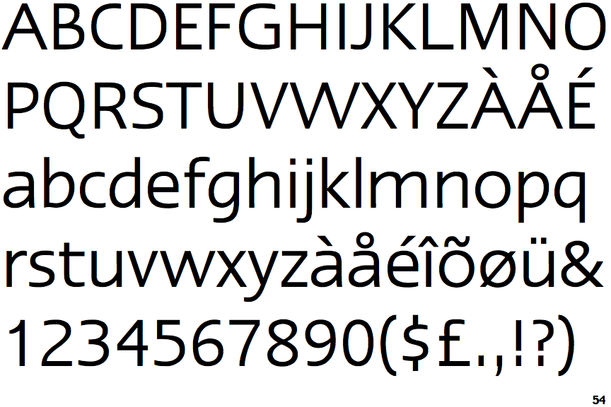
 |
The '$' (dollar) has a single line which does not cross the 'S'.
|
 |
The centre vertex of the upper-case 'M' is on the baseline.
|
 |
The top storey of the '3' is a smooth curve.
|
 |
The centre bar of the upper-case 'P' meets the vertical.
|
 |
The lower-case 'g' is single-storey (with or without loop).
|
 |
The upper-case 'J' has no bar.
|
 |
The leg of the upper-case 'R' is curved outwards.
|
 |
The centre bar of the upper-case 'R' meets the vertical.
|
 |
The strokes are upright.
|
 |
The lower-case 'e' has a straight horizontal bar.
|